Visual Brand Identity
May 2021
May 2021
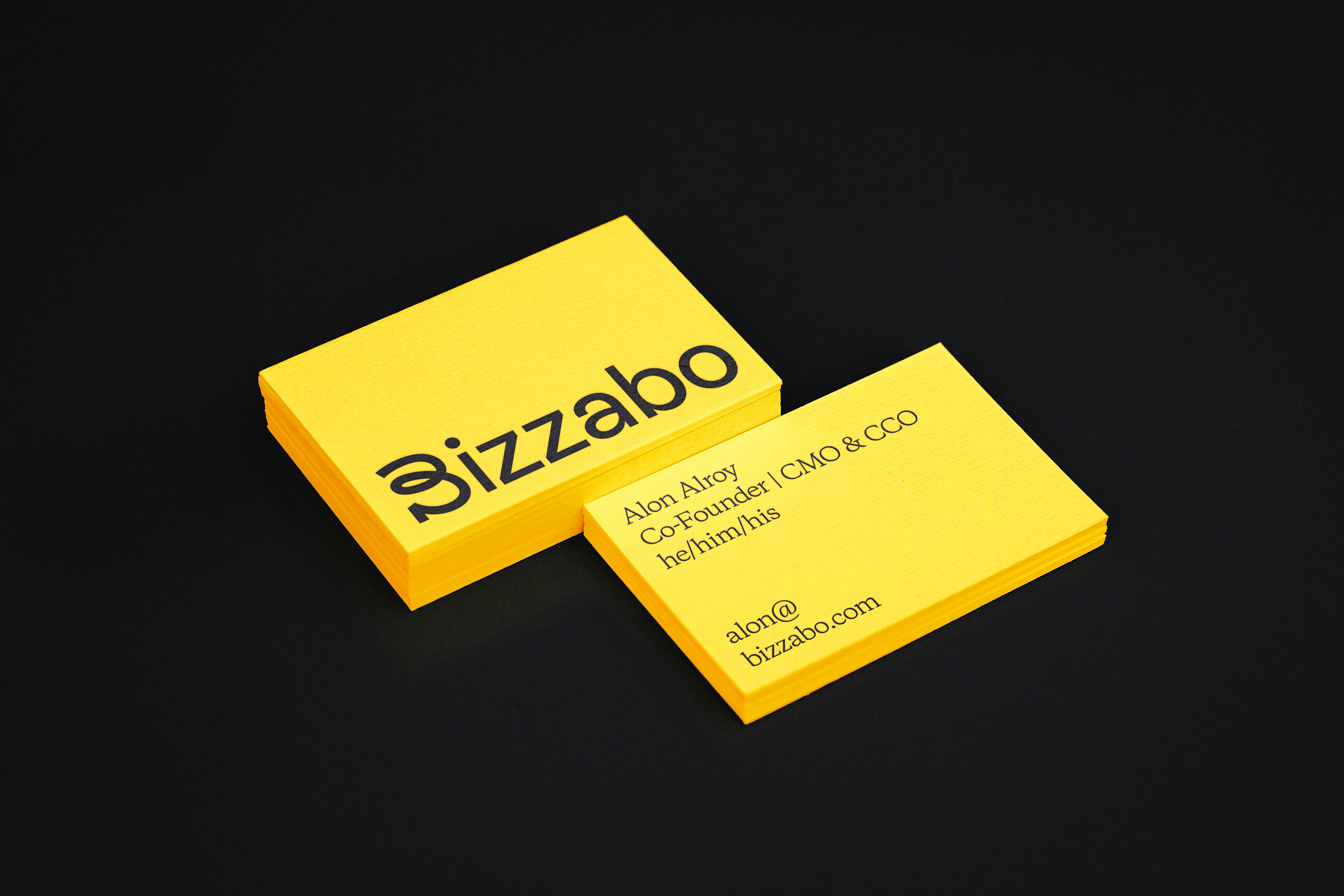
We worked with our friends at Gold Front on the visual identity design for Bizzabo, a data-rich open platform that allows Event Experience Leaders to manage events, engage audiences, activate communities, and deliver powerful business outcomes — all while powering immersive in-person, virtual, and hybrid experiences.
Bizzabo has more than 300 employees in its New York, Tel-Aviv, Kyiv, and London offices, as well 15+ remote locations around the world and is trusted by world-leading brands to power their events — from Fortune 100 enterprise organizations and financial institutions to creative agencies and scaling tech companies.
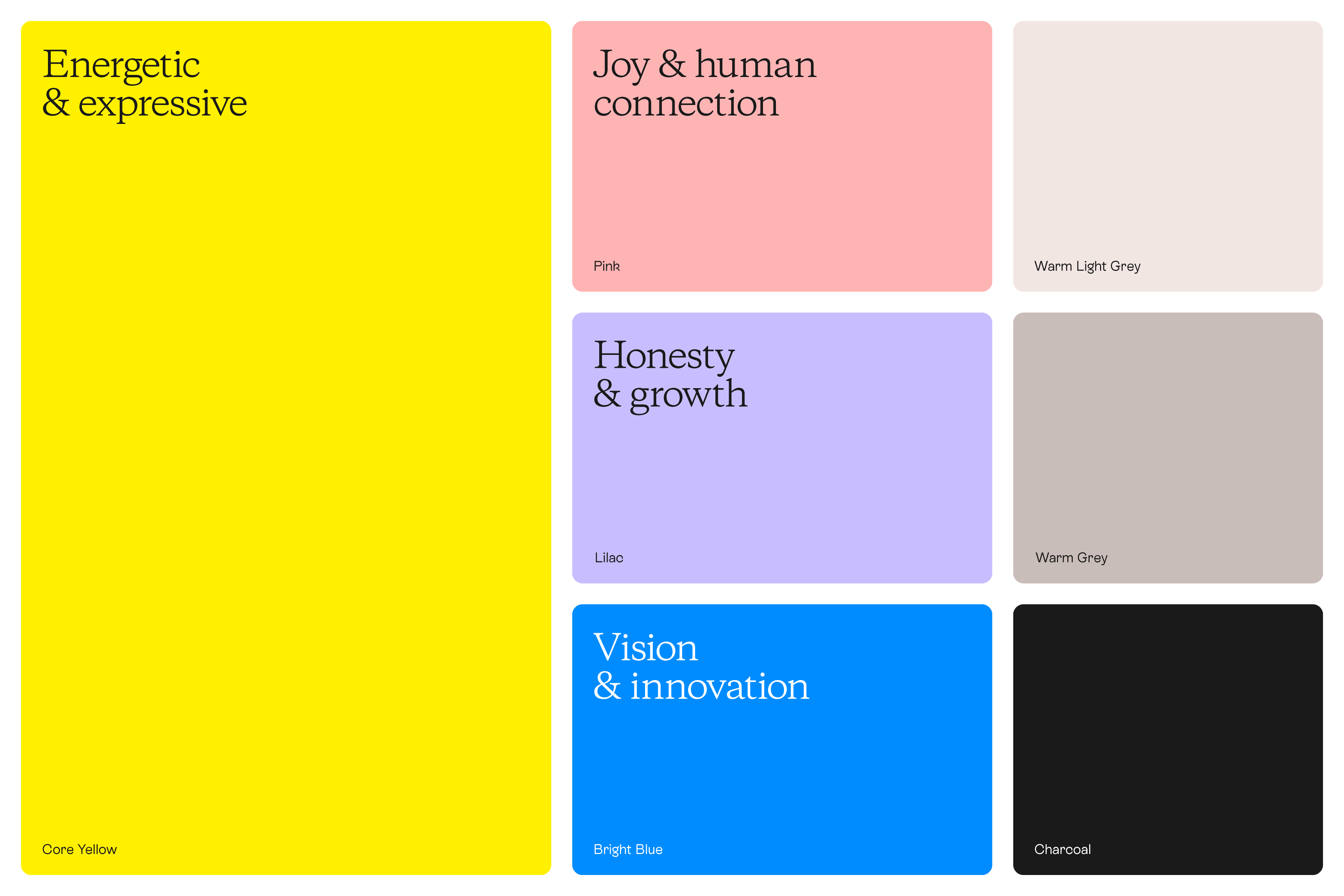
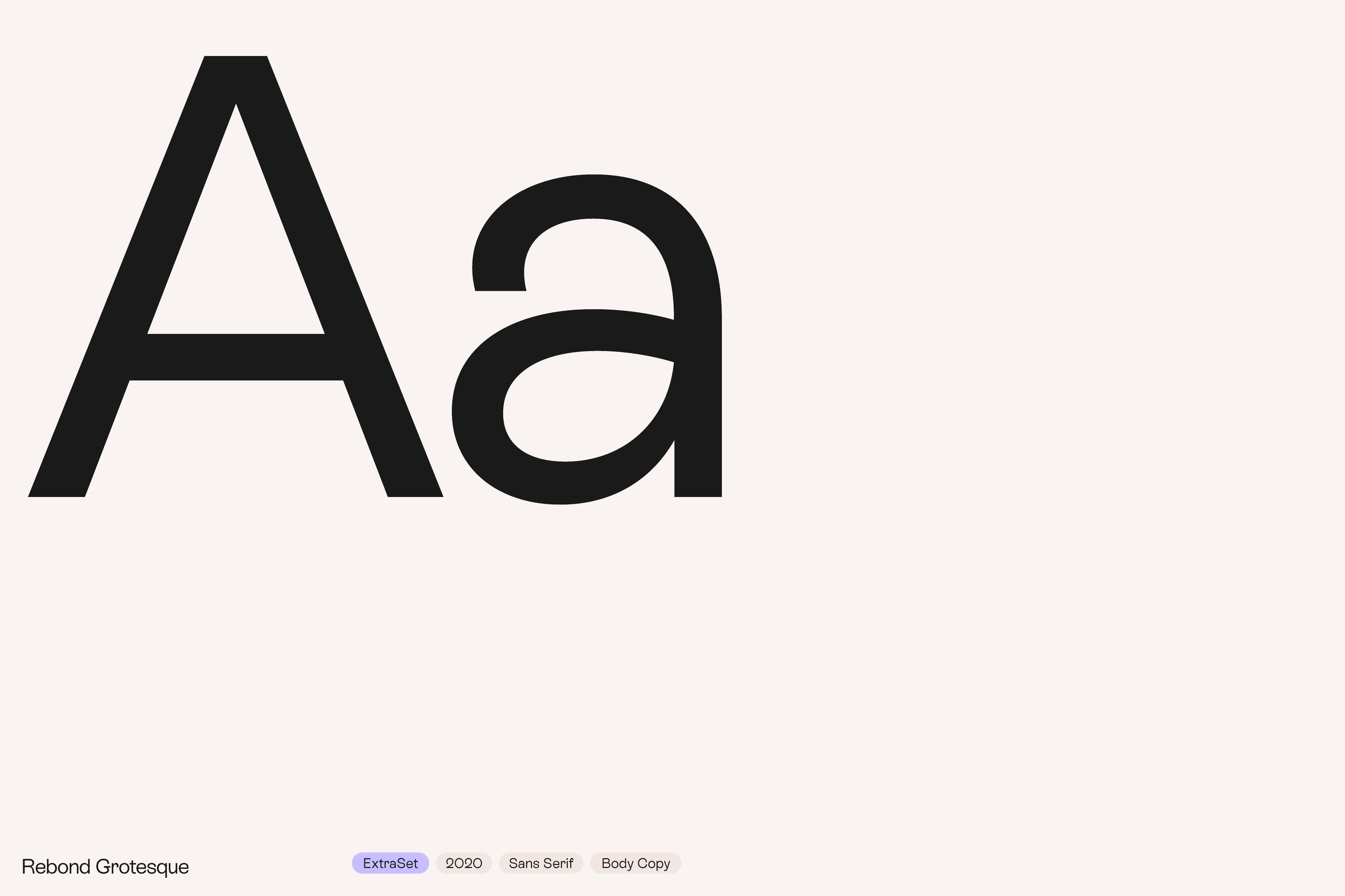
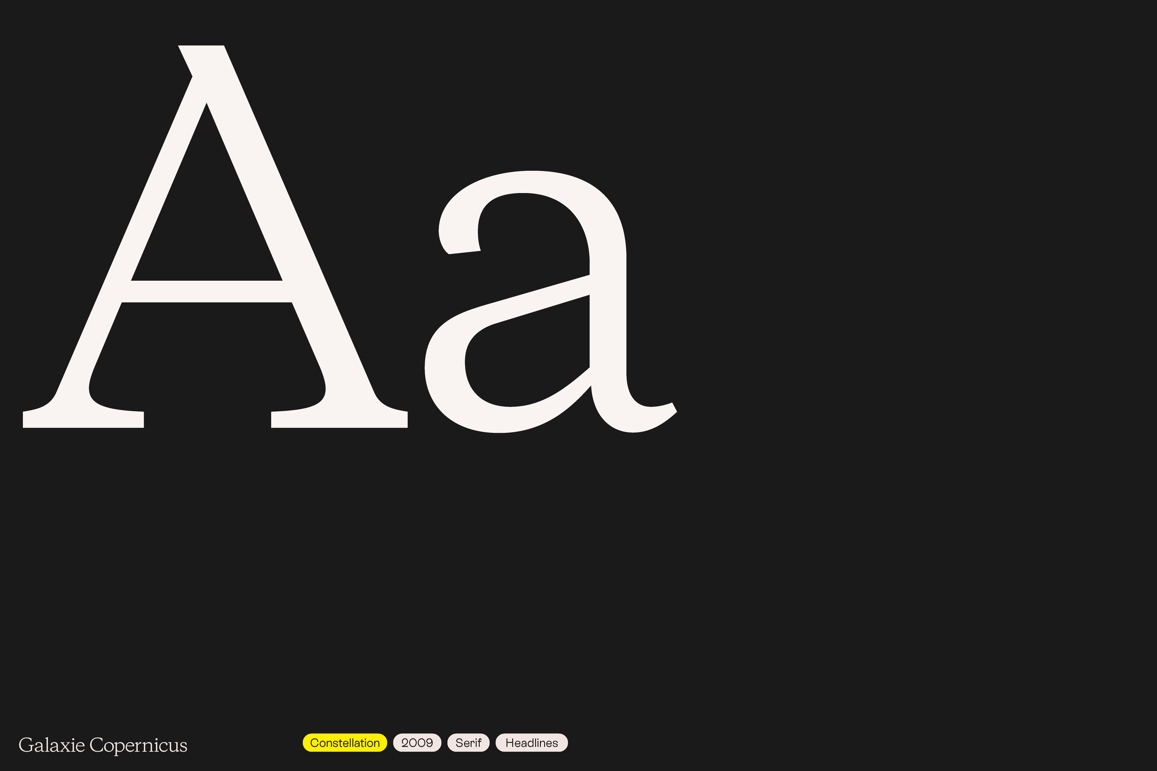
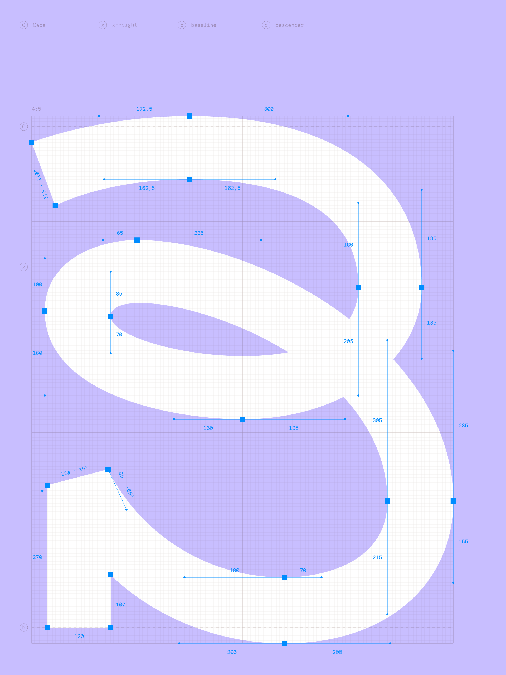
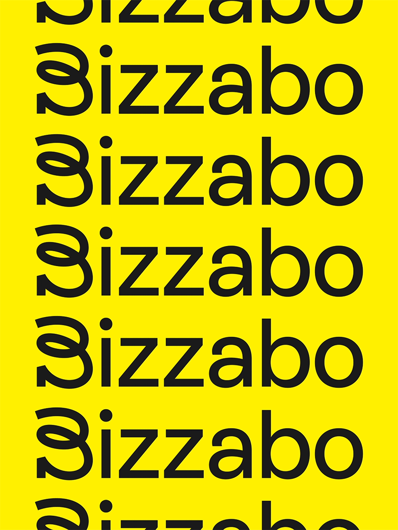
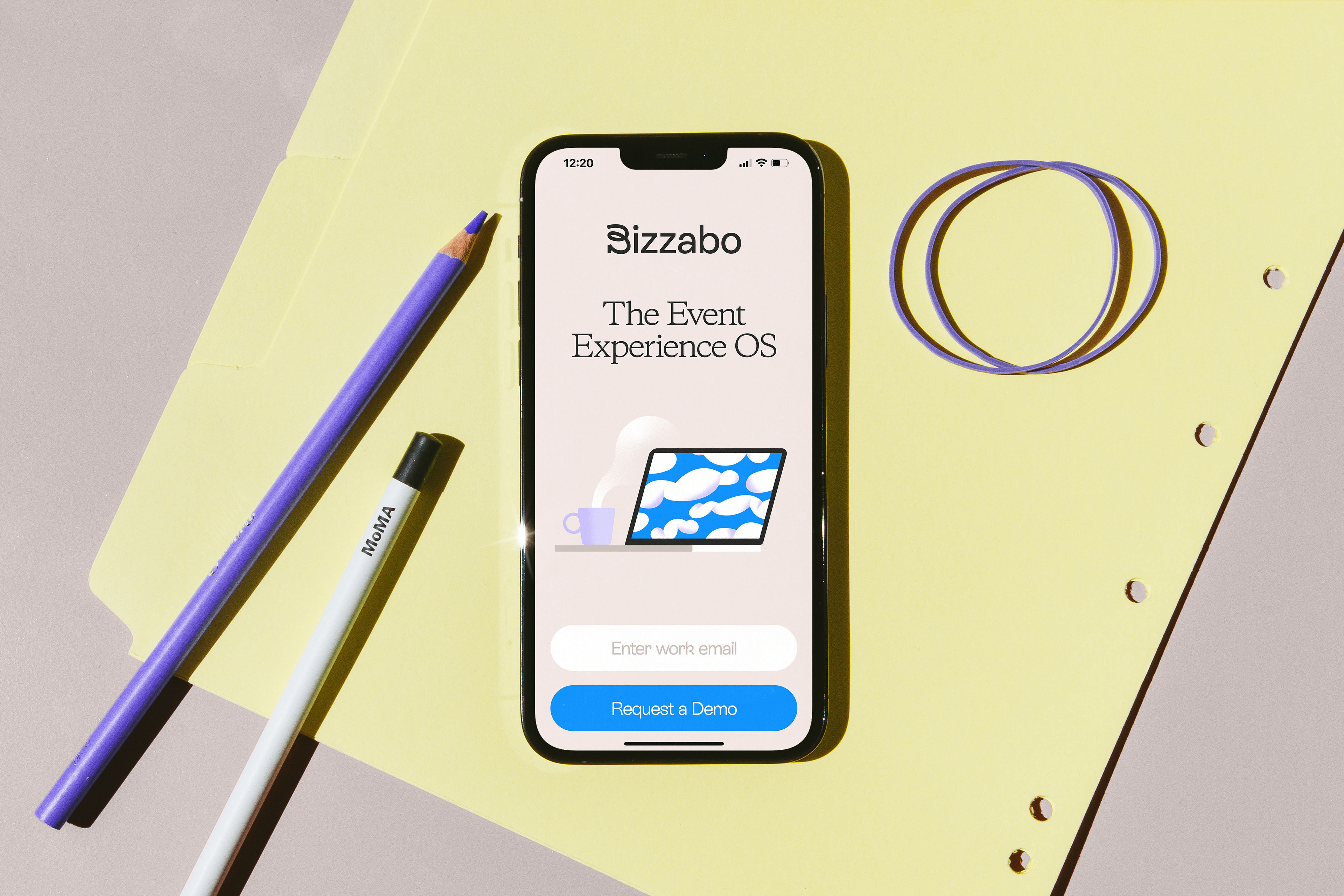
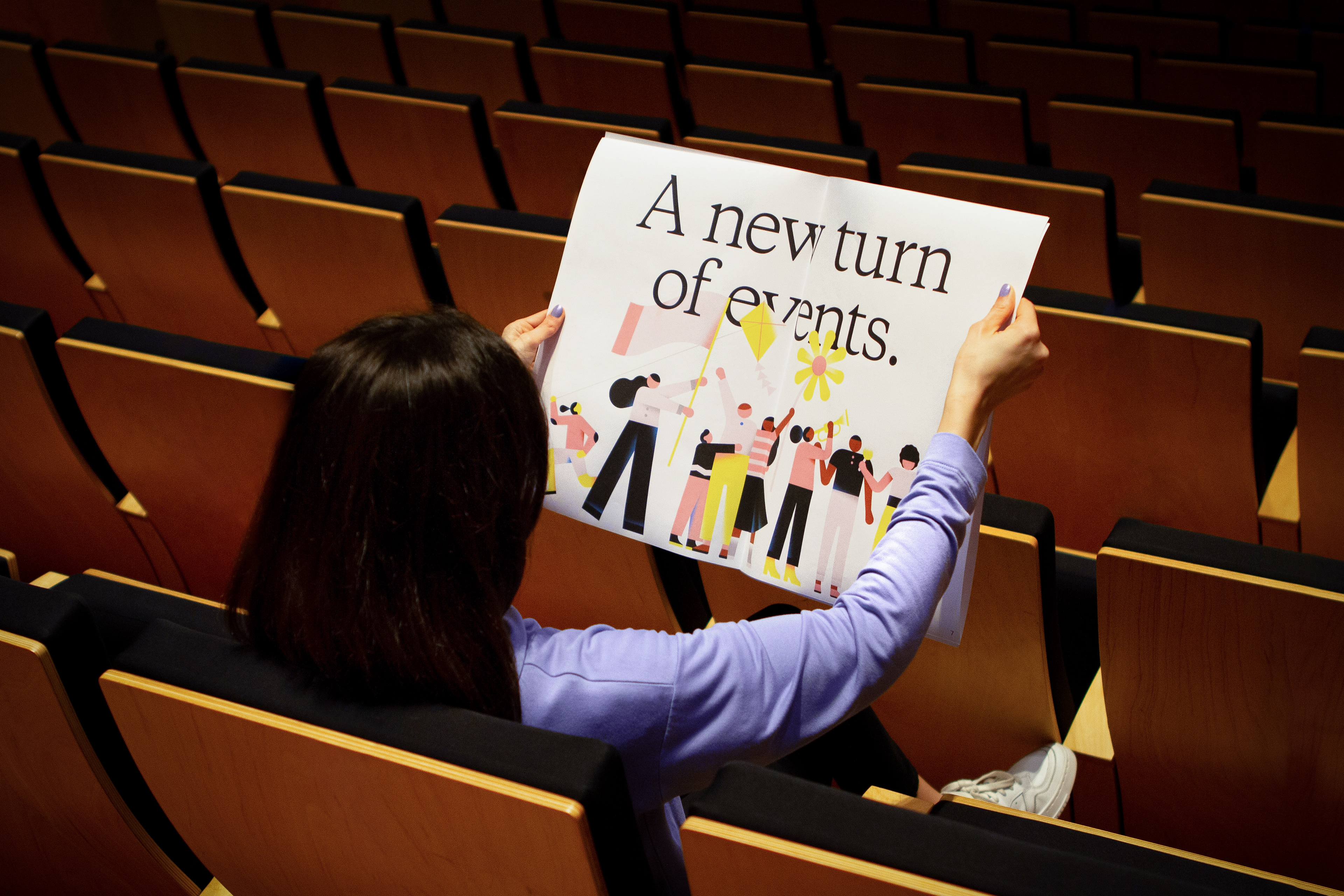
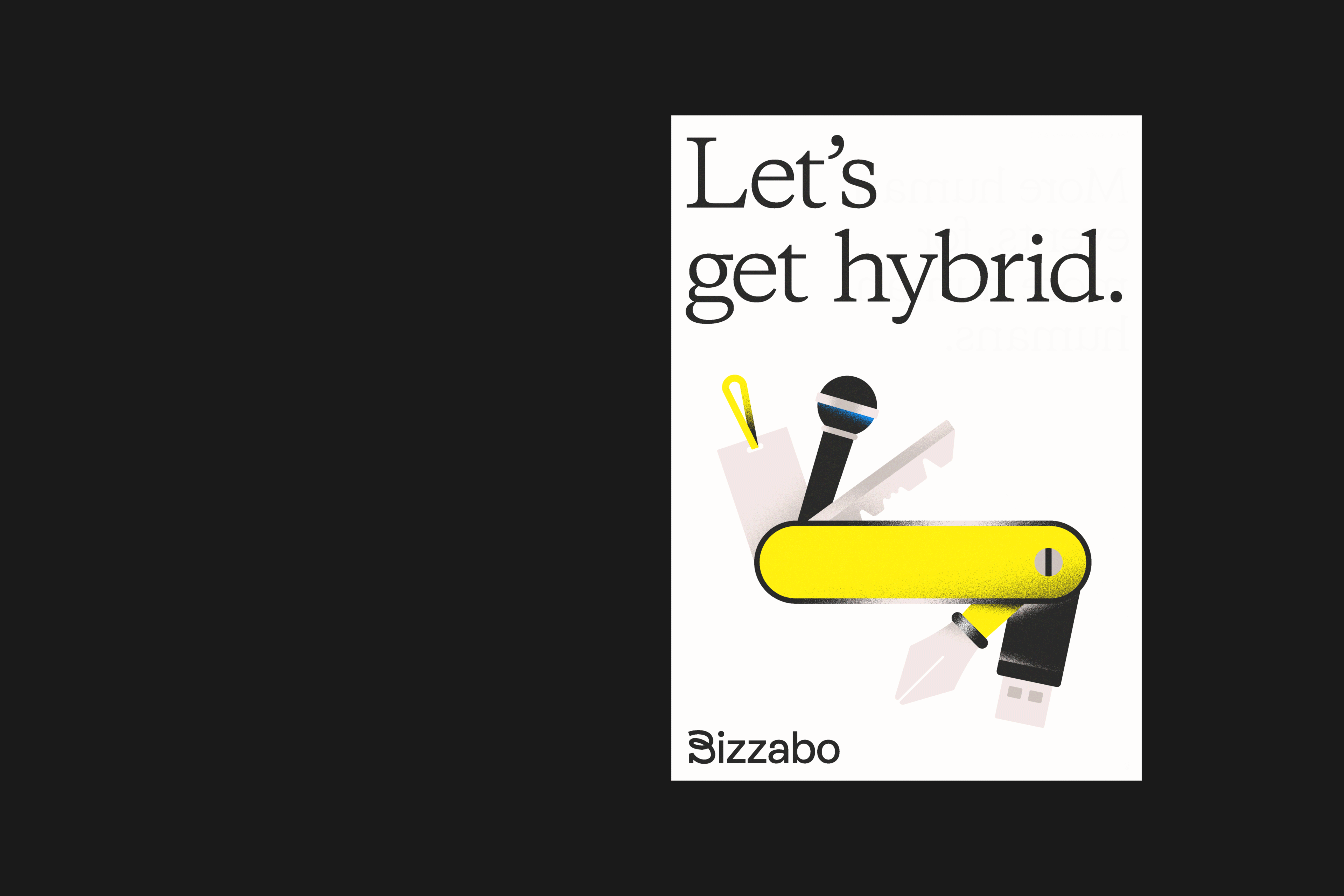
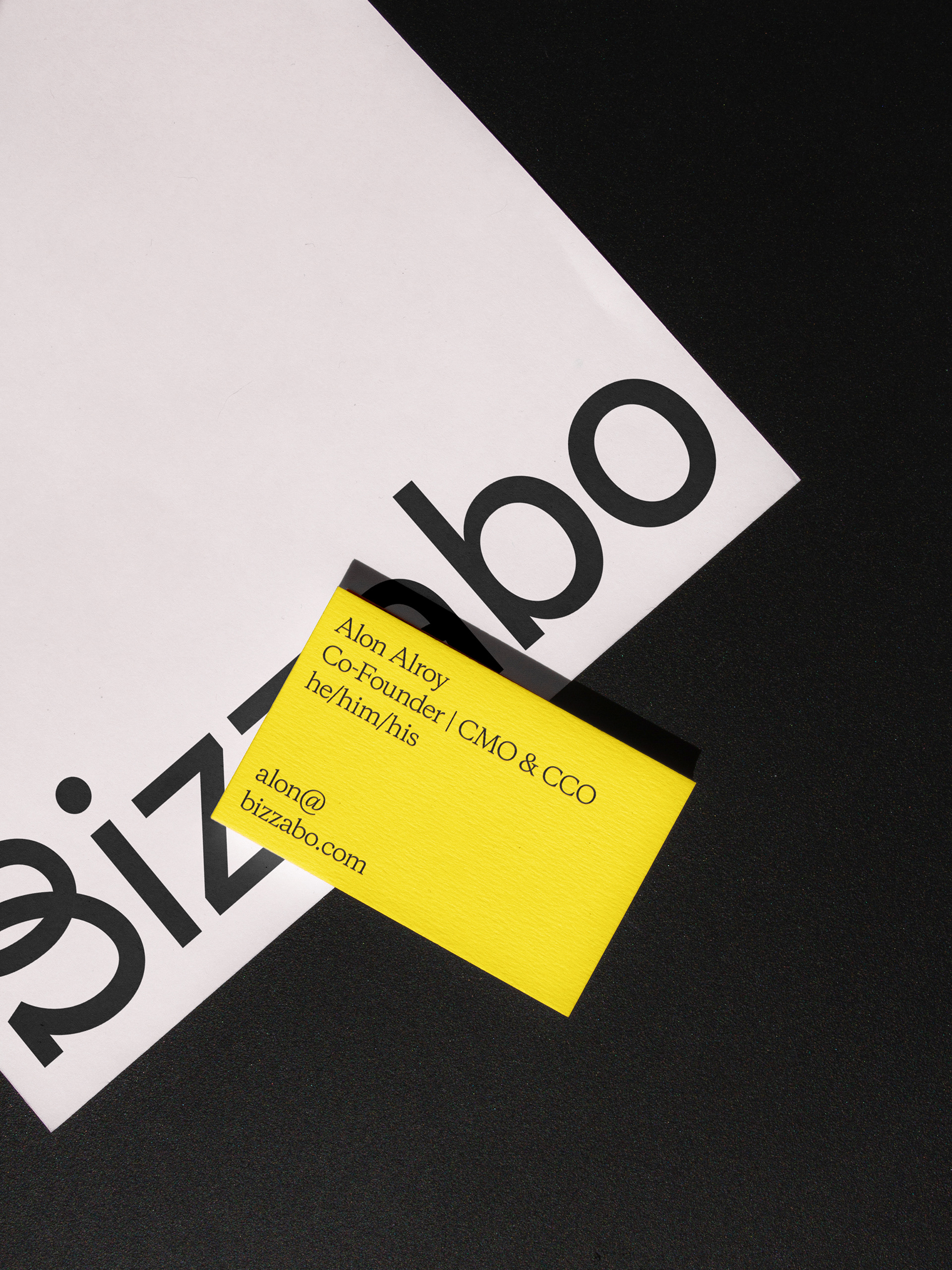
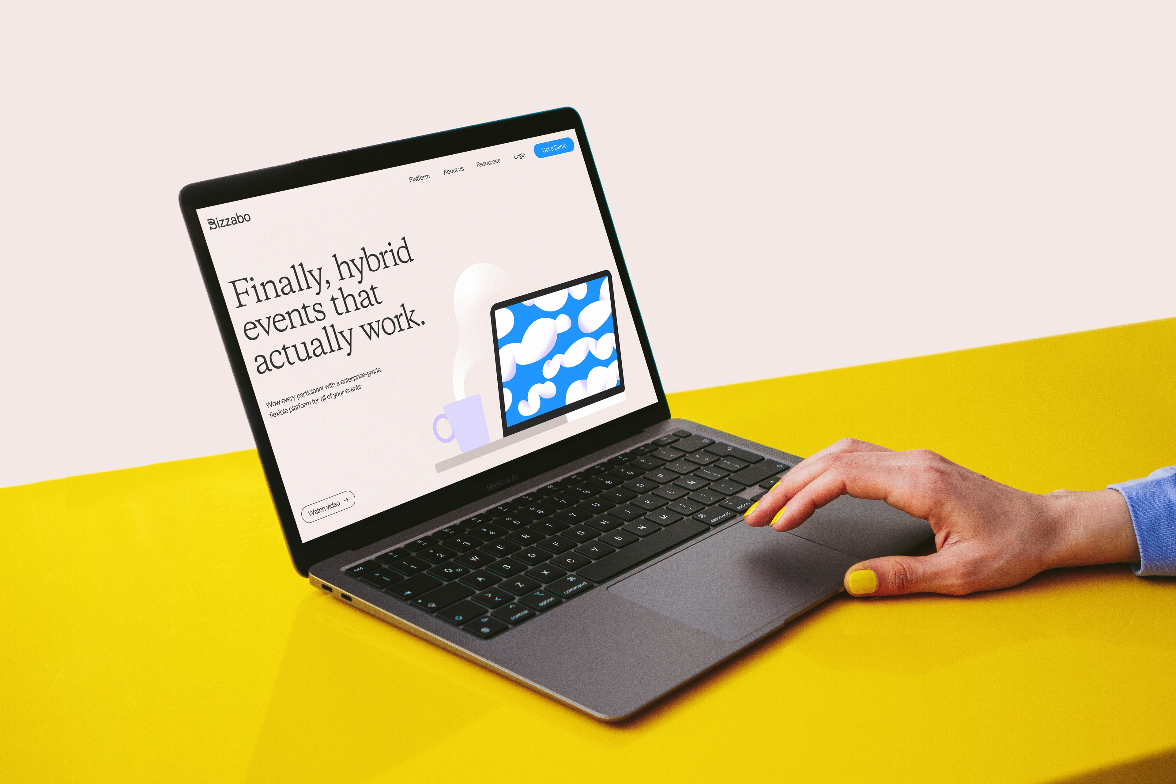
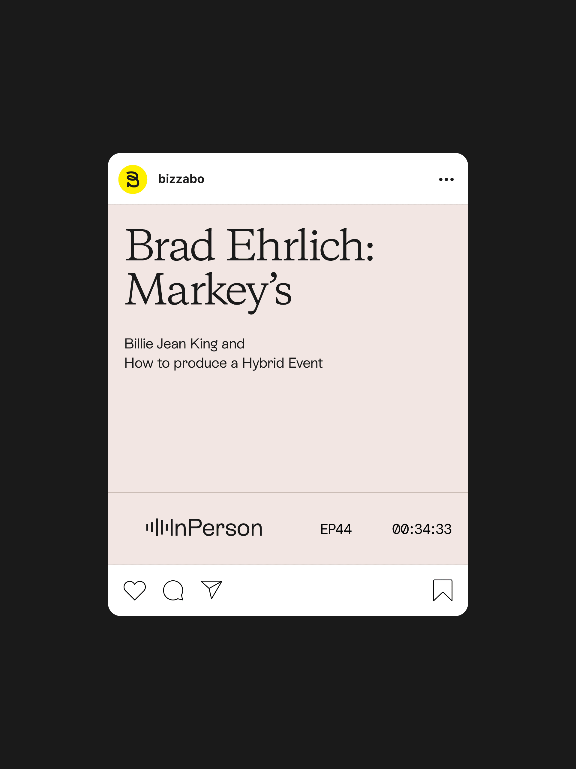
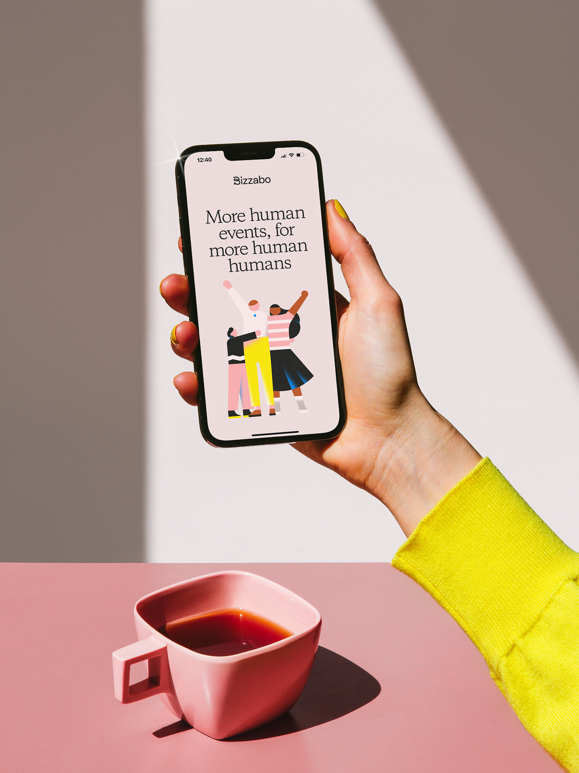
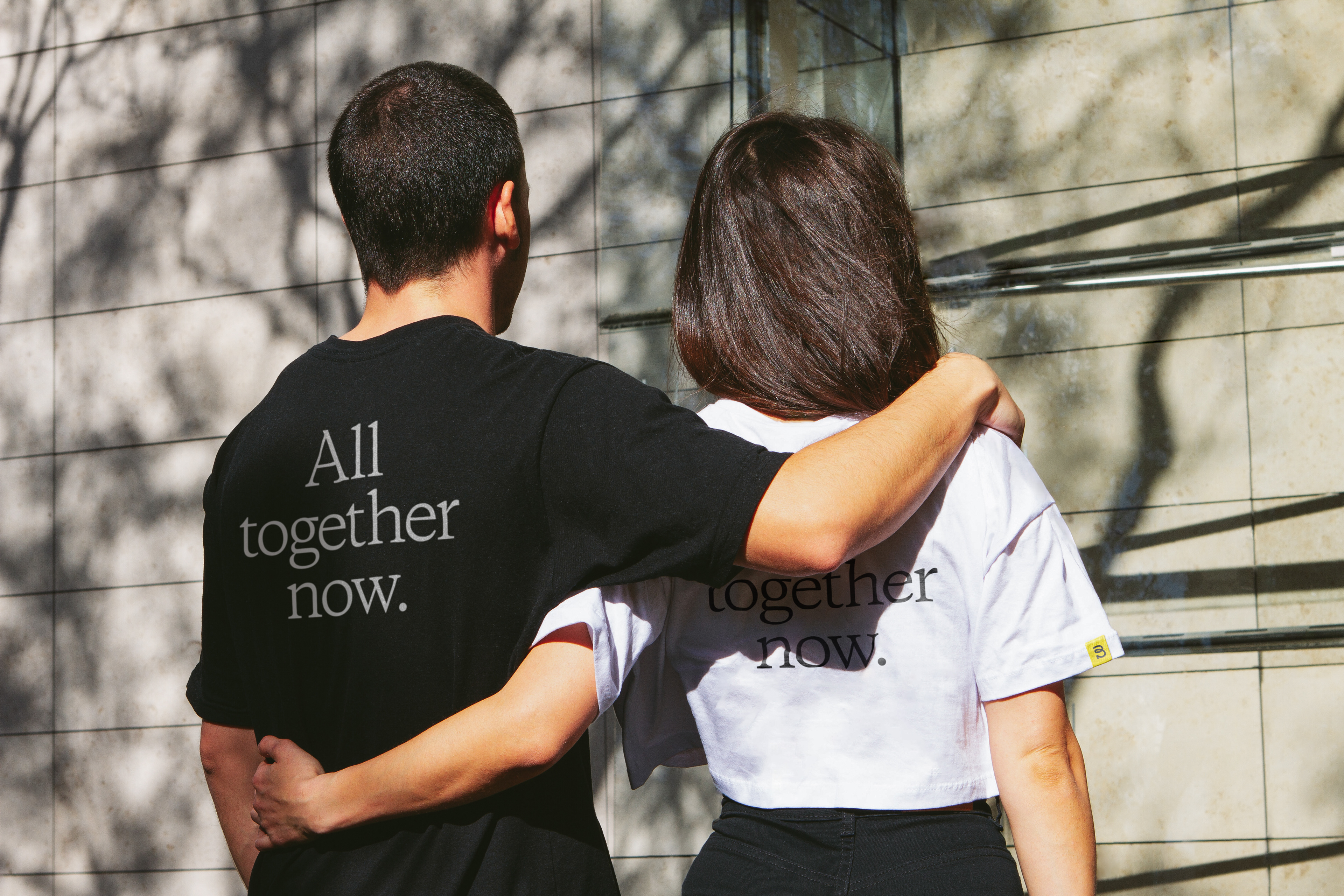
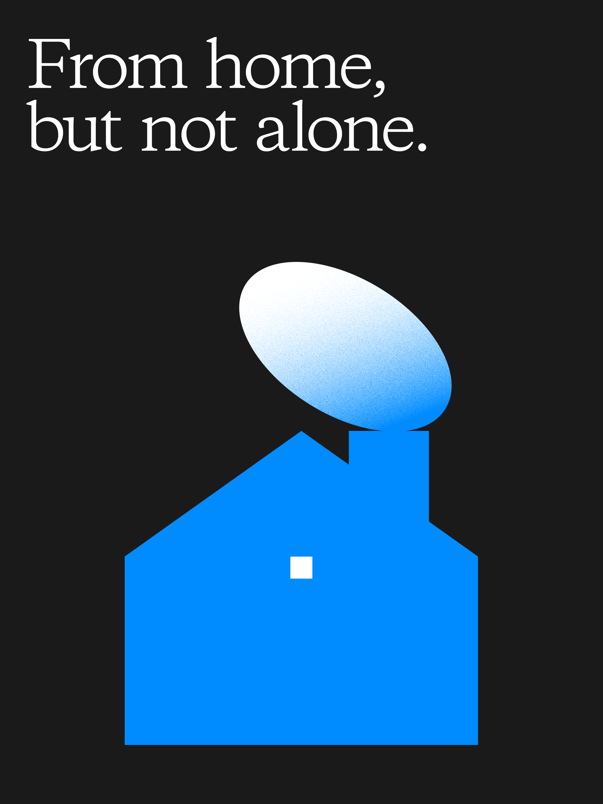
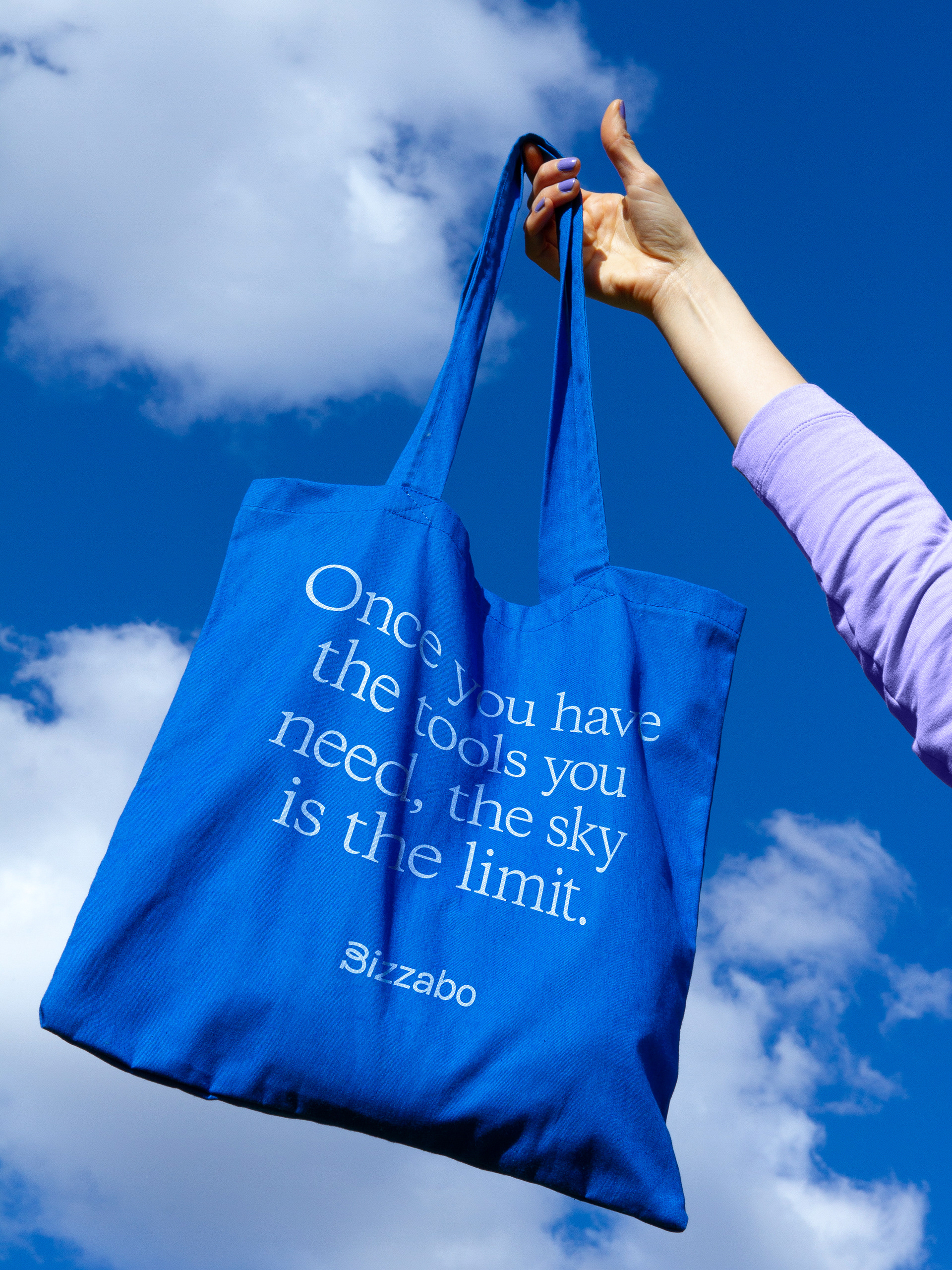
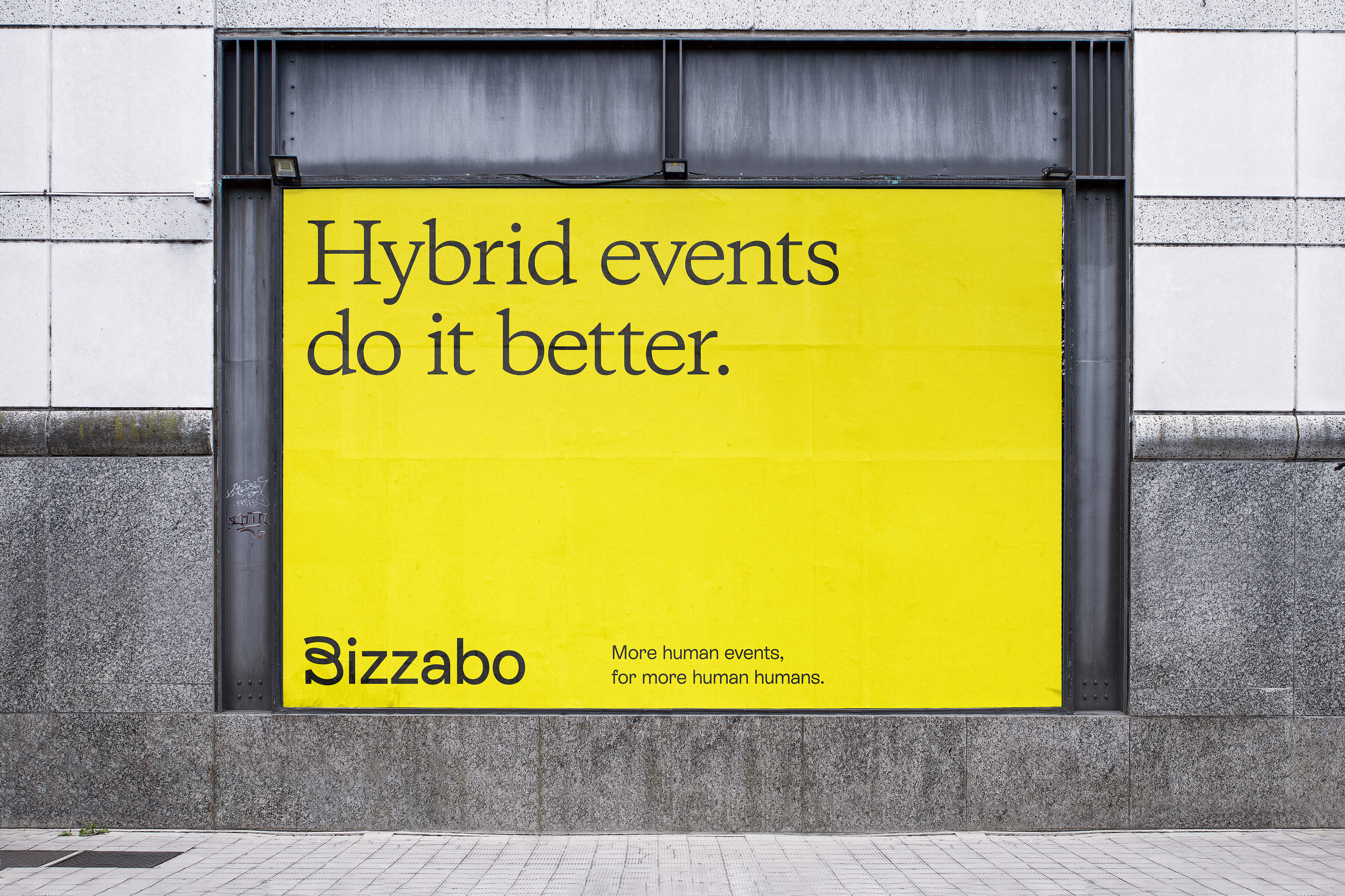
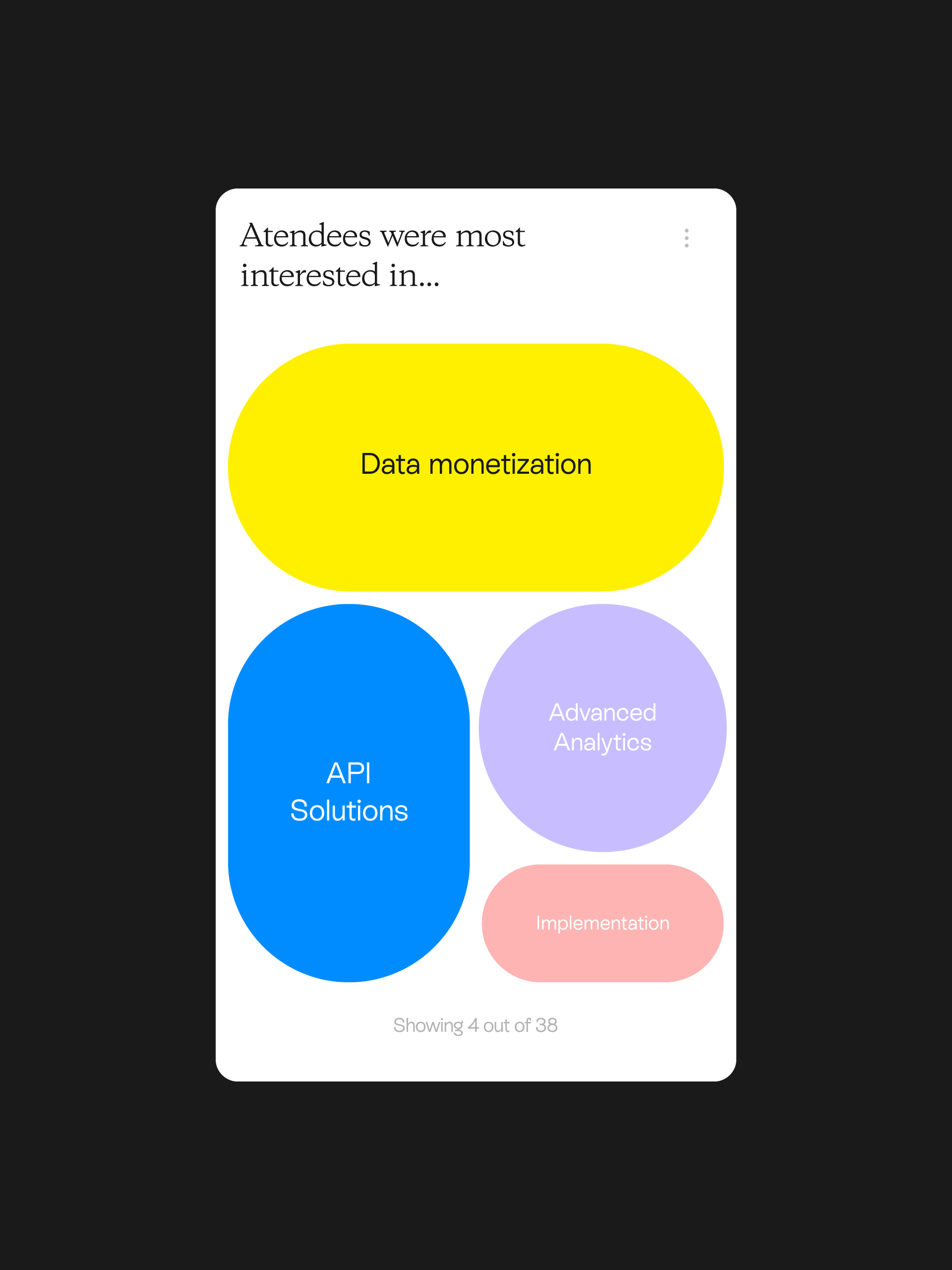
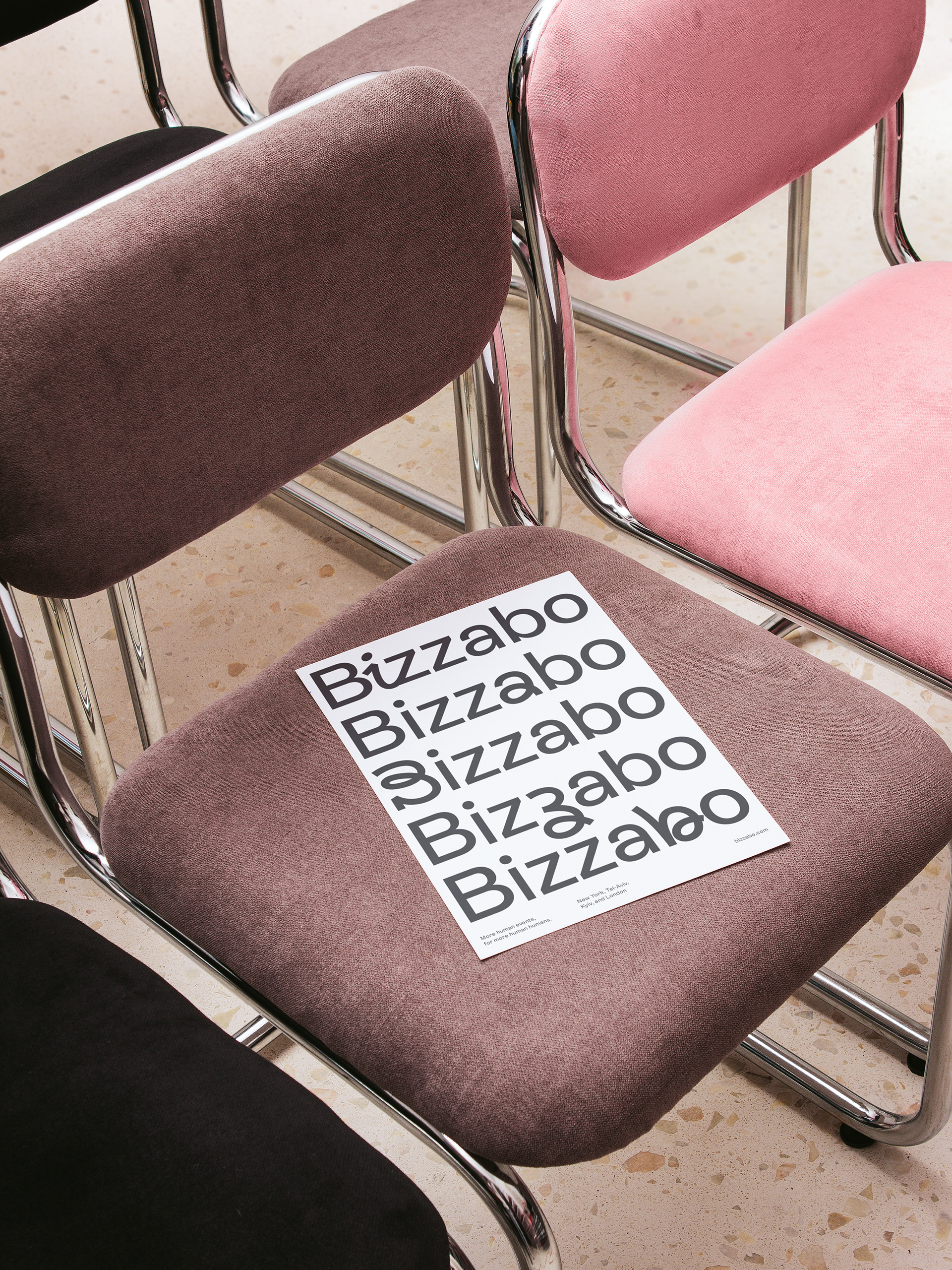
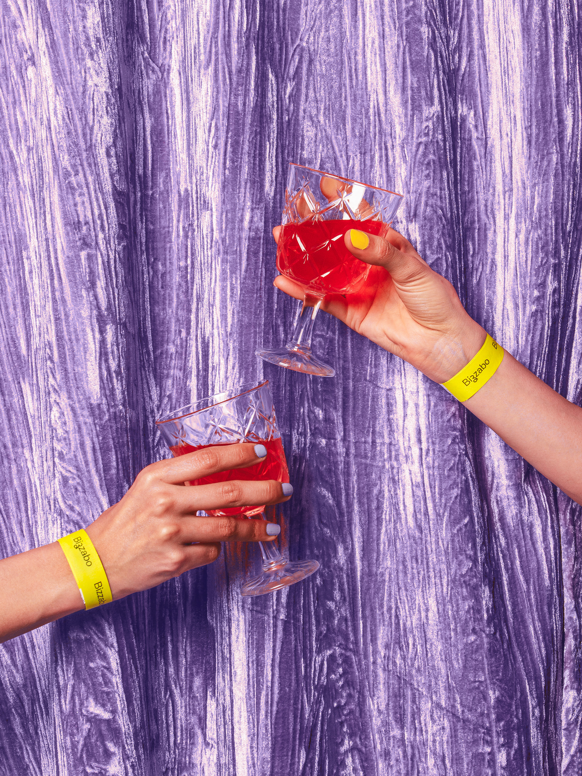
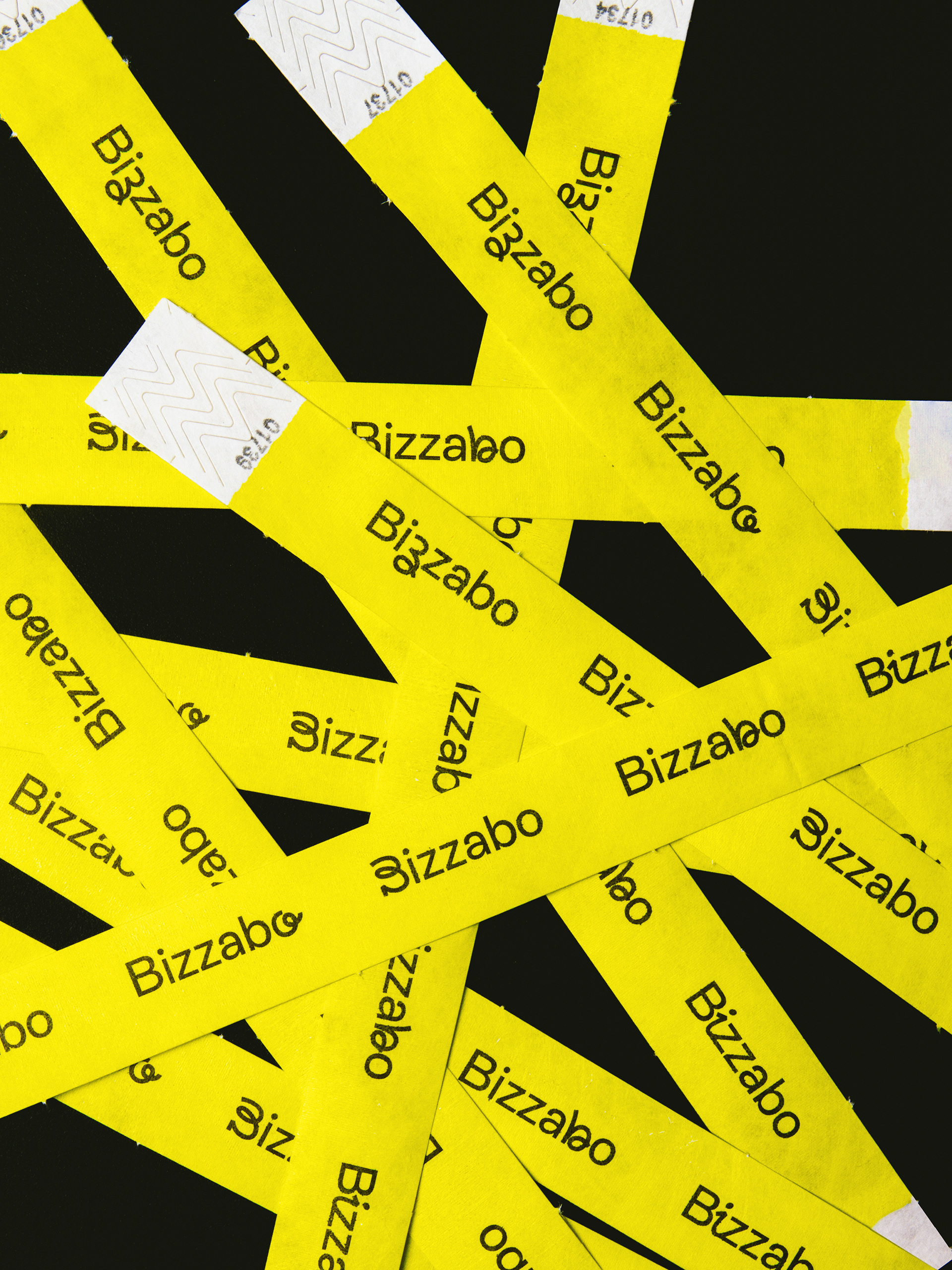
We designed a dynamic logotype with changing doodle-like script letters combined with sans serif type —the quirky Rebond Grotesque— that reflected the friendly and upbeat personality of Bizzabo as a brand, and at the same time, the versatility and hybrid aspects of Bizzabo as a tool. A new bright and fun color palette was introduced, moving away from the cliché tech blue hues. Human photography, and whimsical illustrations captured the spirit of Bizzabo’s hybrid event experiences. On the type side, Rebond Grotesque was paired with a serif face —Galaxie Copernicus— for headlines, to add human warmth, and also reinforce the "hybrid" concept throughout the visual identity.


Project
Brand Studio: Gold Front
Creative Direction: Josh Lowman (Gold Front)
Art Direction & Design: Asís
Illustrations: Giacomo Bagnara
Client: Bizzabo
Creative Direction: Josh Lowman (Gold Front)
Art Direction & Design: Asís
Illustrations: Giacomo Bagnara
Client: Bizzabo
Case Study
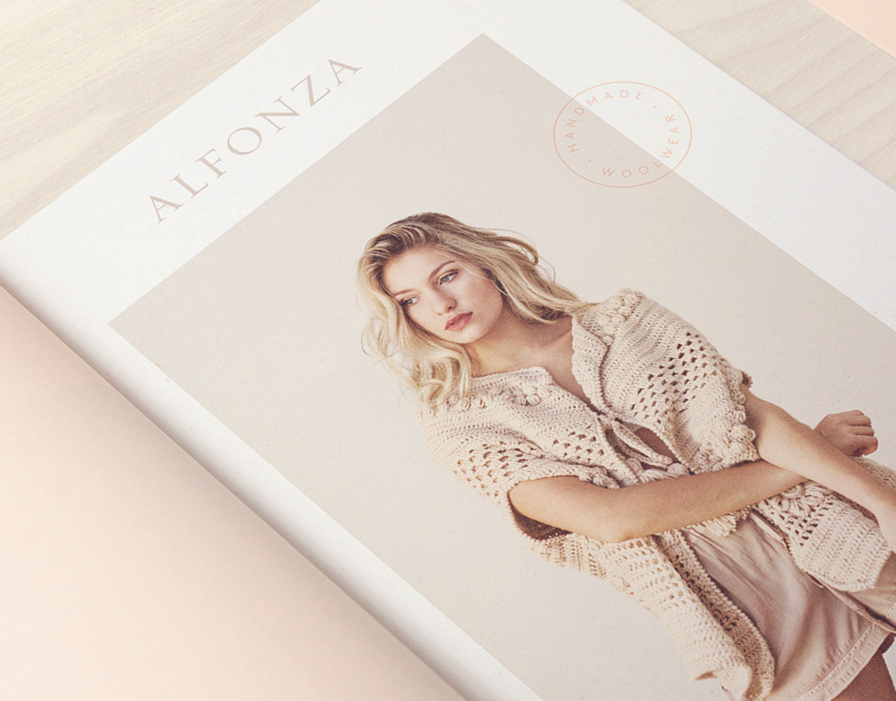
Art Direction: Asís
Photography: Cecilia Armand Ugon
Photo Assist: Natasha Venturiero
Model: Mercedes Mendez
Animations: Bruno Persico
Photography: Cecilia Armand Ugon
Photo Assist: Natasha Venturiero
Model: Mercedes Mendez
Animations: Bruno Persico