Visual Brand Identity
Jan 2020
Jan 2020
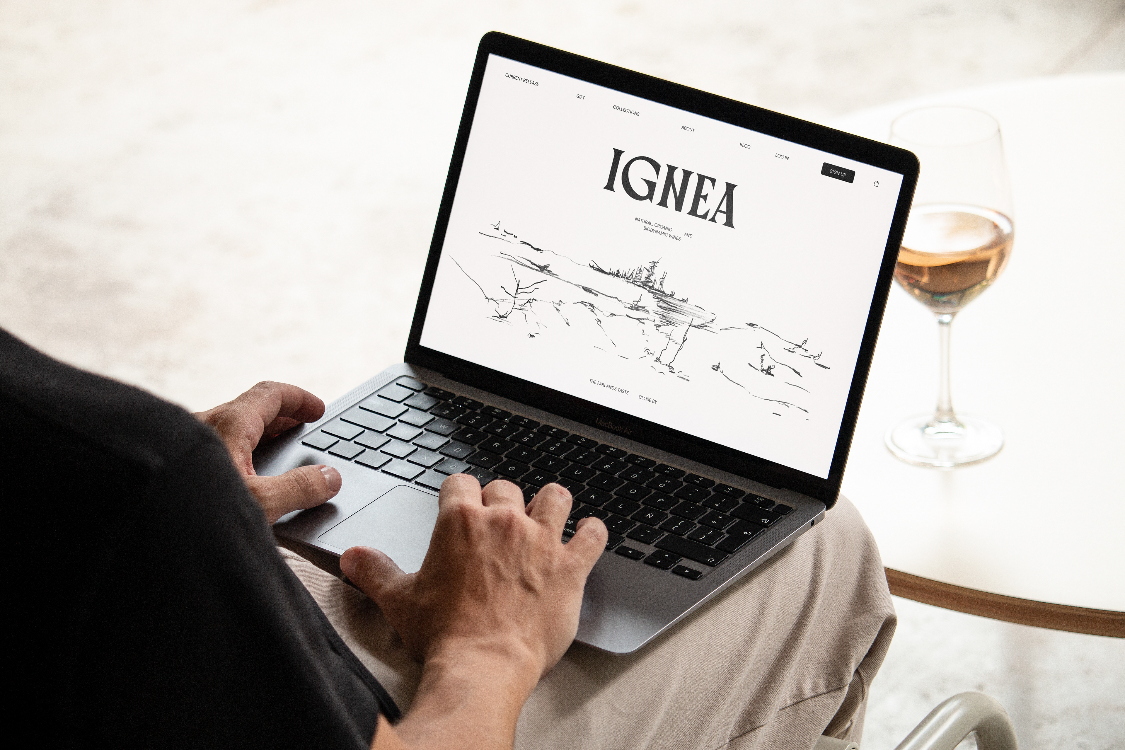
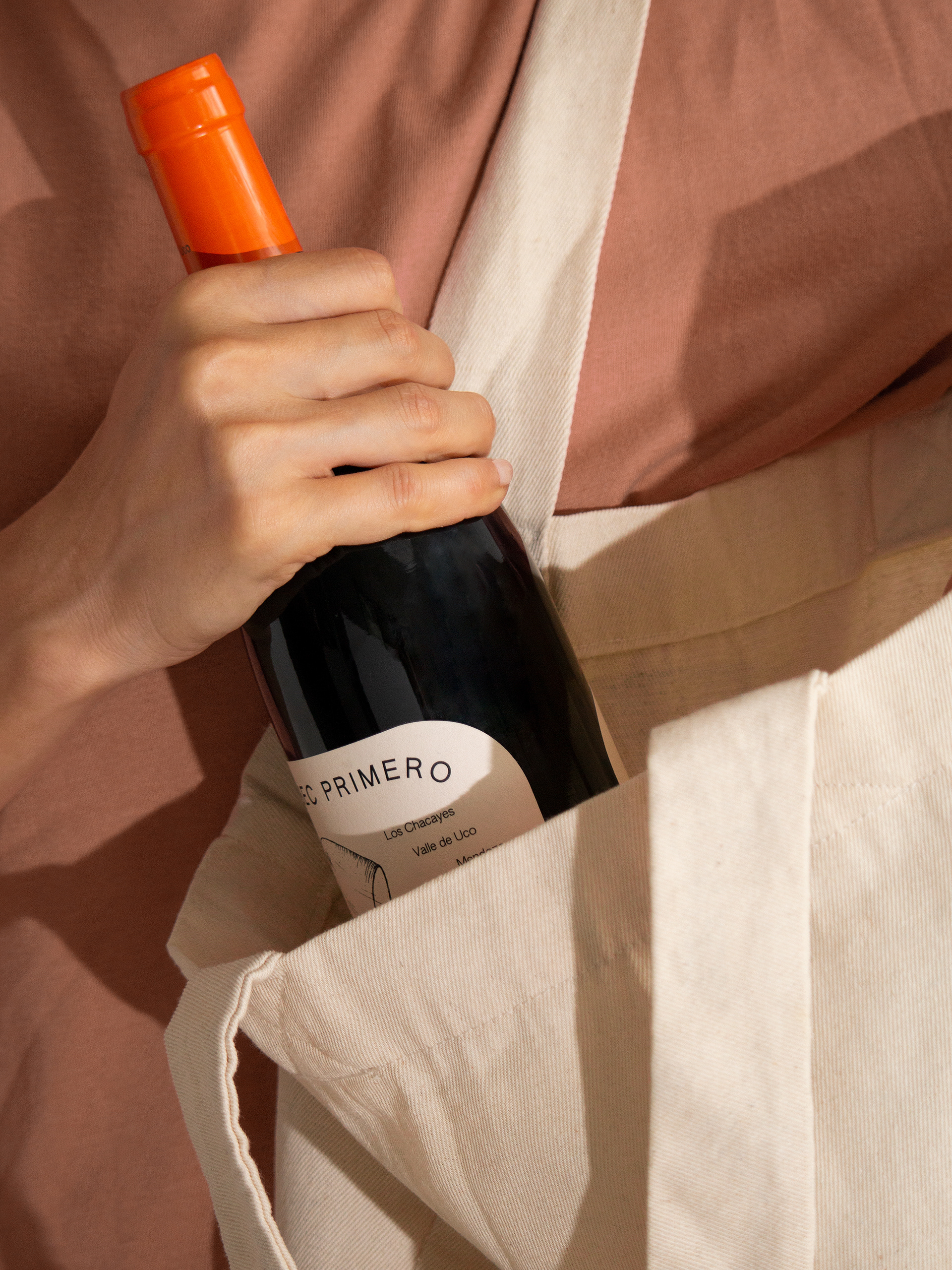
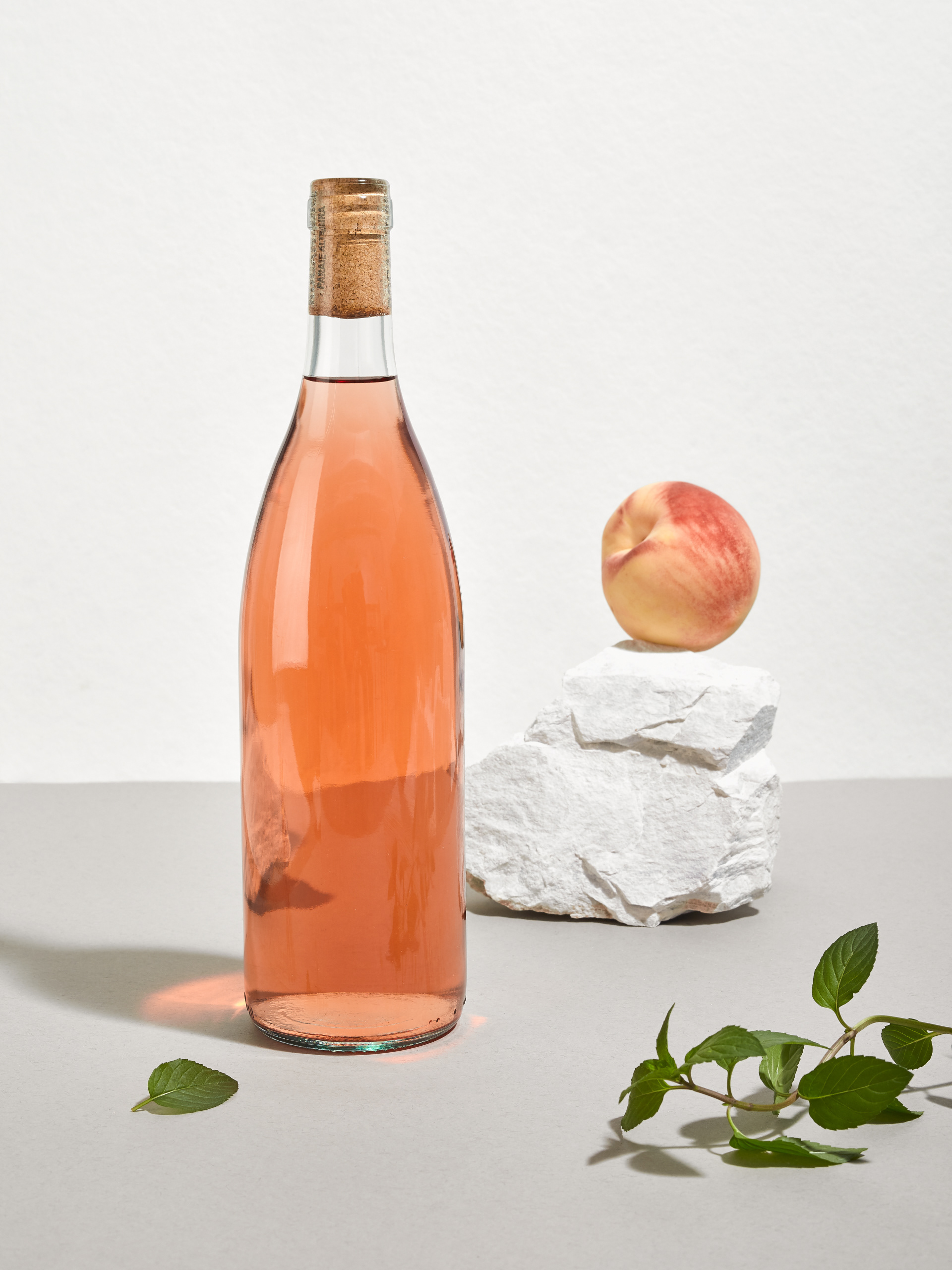
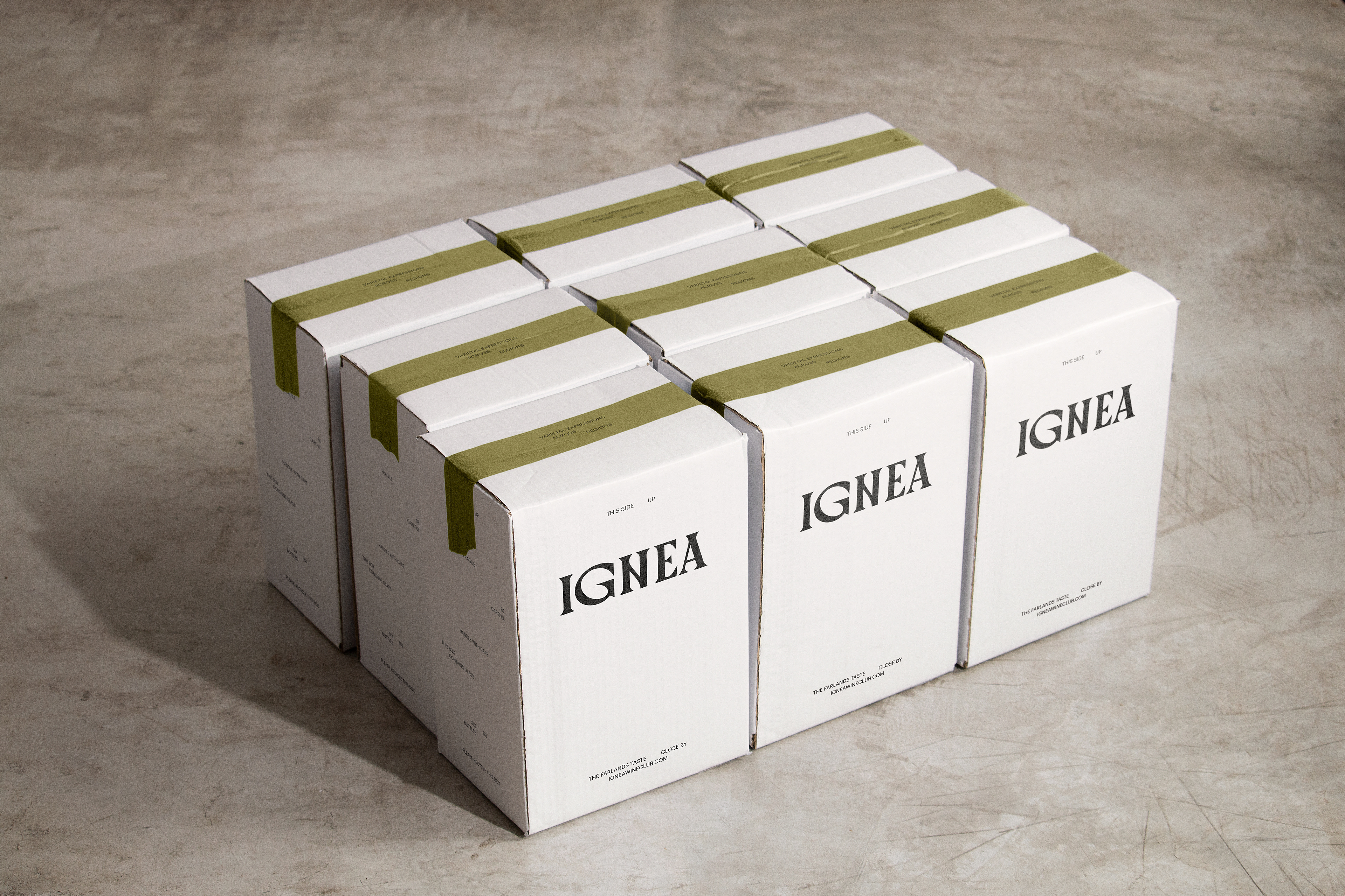
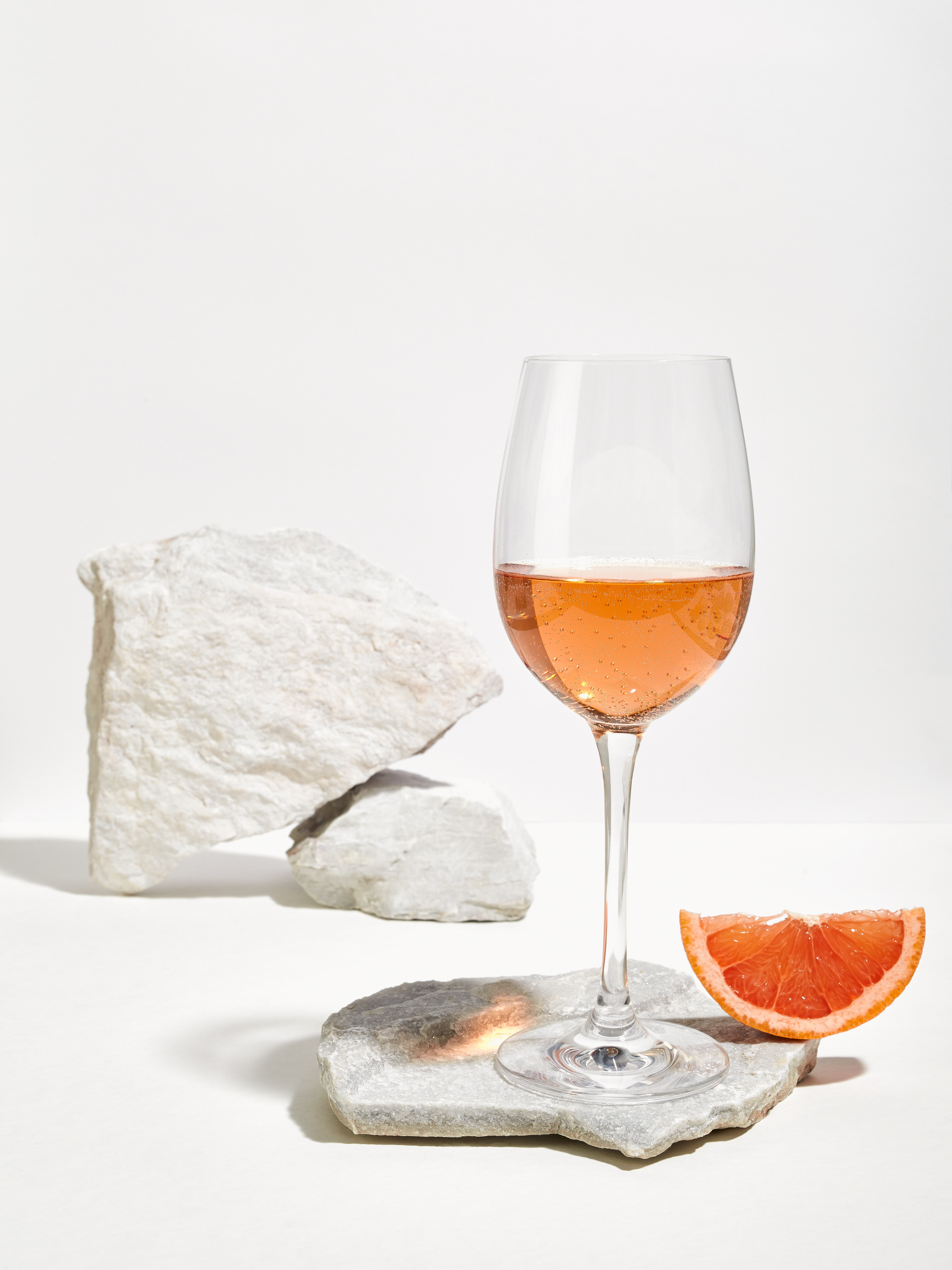
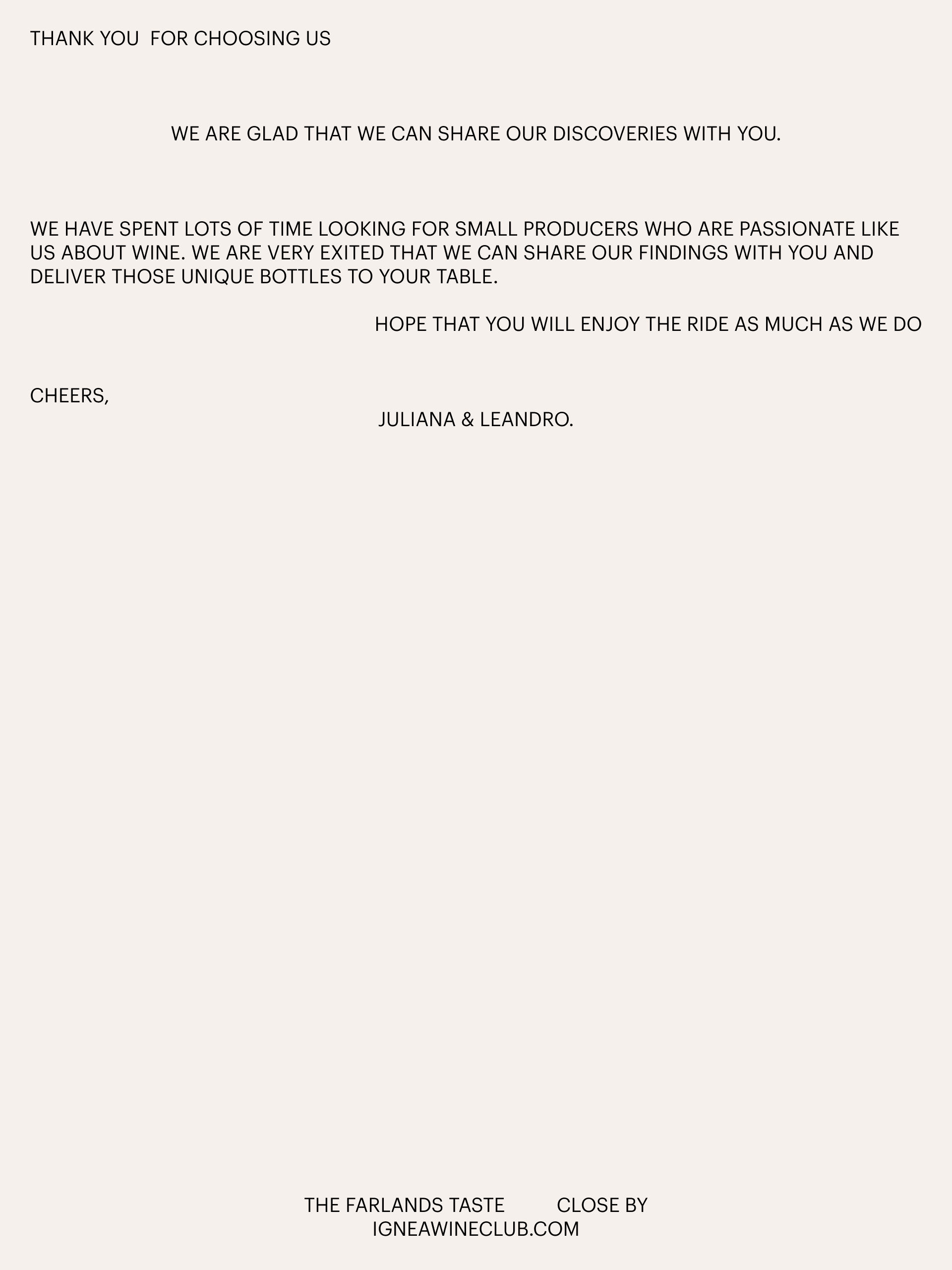
Ignea is a wine club and online store specialized in natural, organic and biodynamic wines. It seeks to bring its subscribers closer to unique wines elaborated by small producers. A team of sommeliers specialized in low-intervention wines are the ones who are constantly searching for new labels to satisfy an audience that wants to explore new flavors.
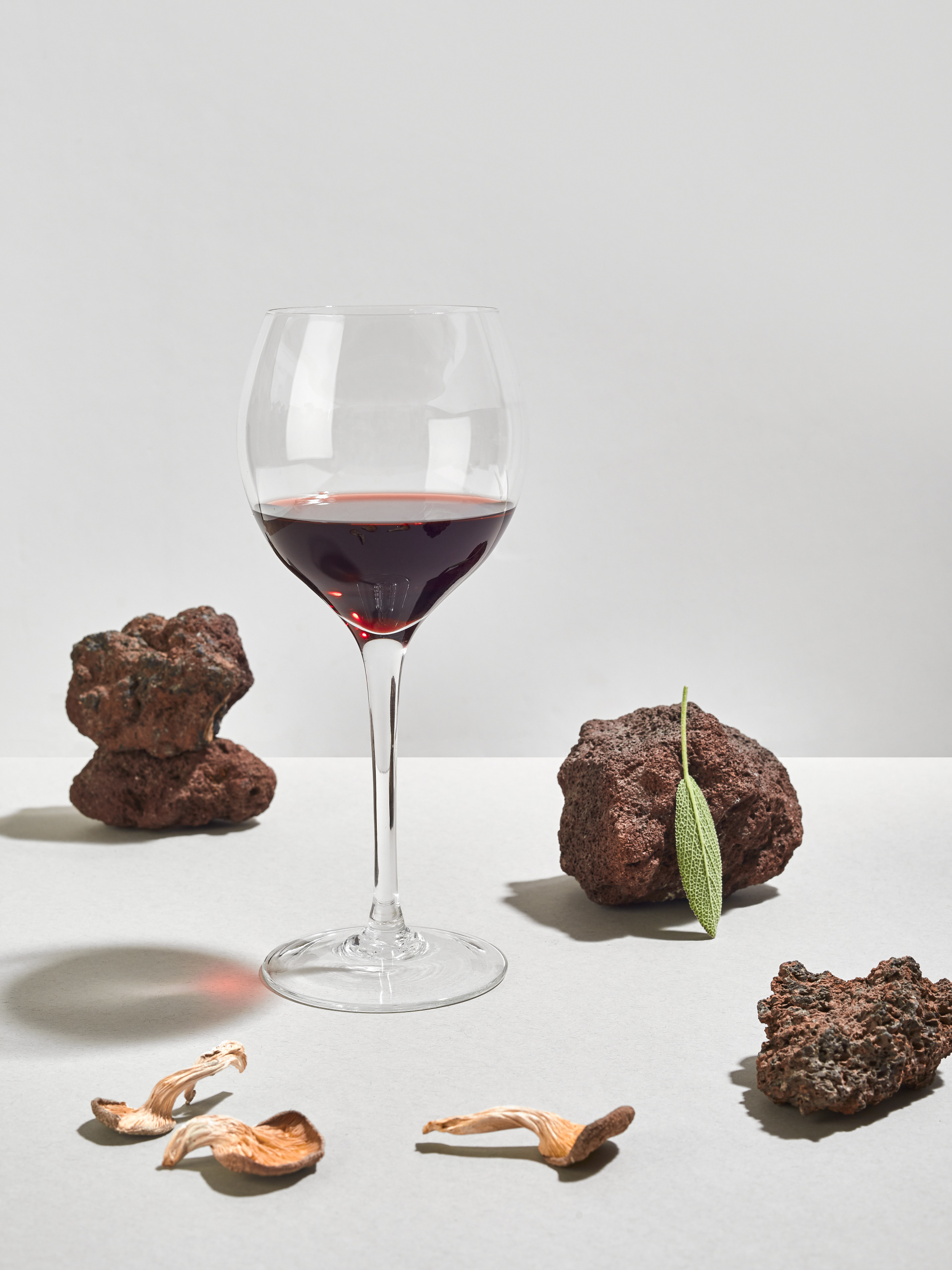
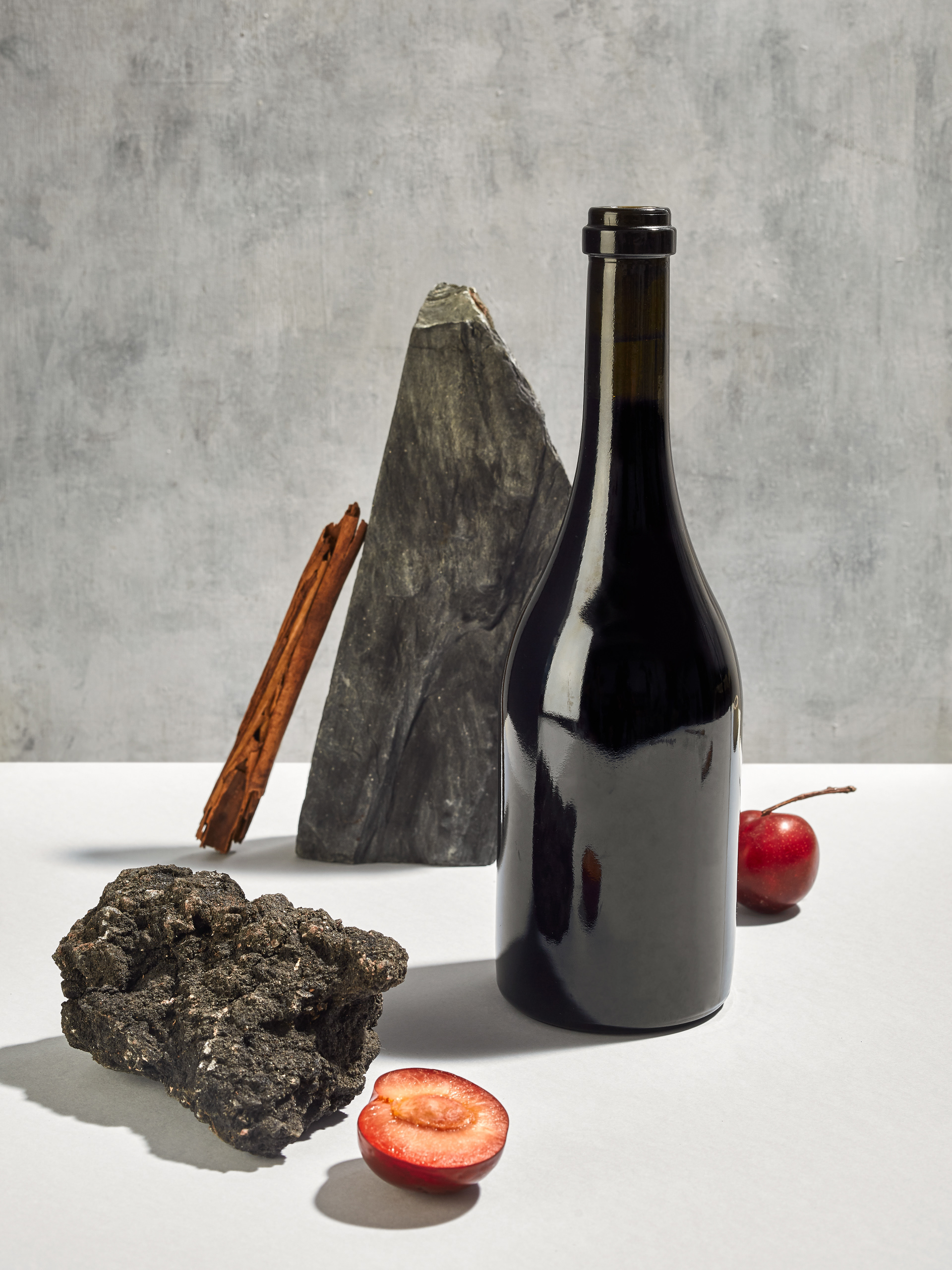
The brand name comes from a type of rock that constitutes a large part of the Earth's mantle and that provides minerals and nutrients to the soil. These elements then reach our taste buds through different notes that we can find in some wines, and that are distinctive to each terroir. Wine always tells about a place and at Ignea they seek to connect their subscribers with the basis of all good wine: the soil.
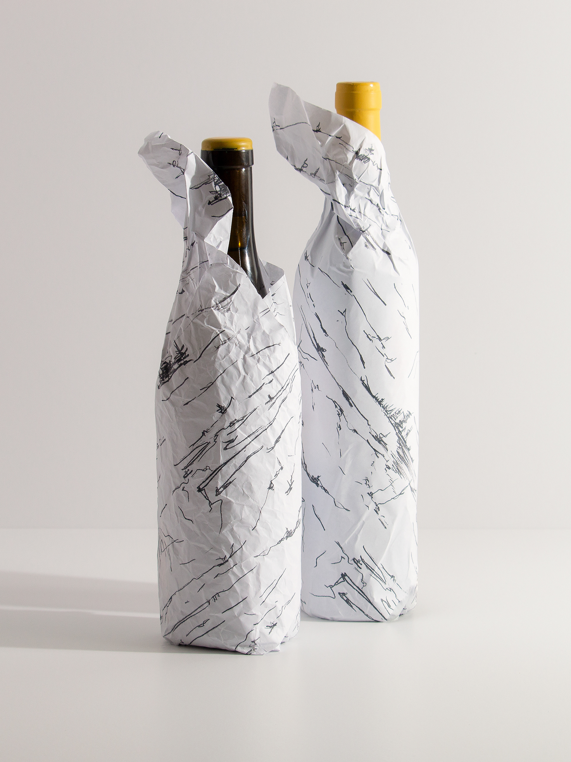
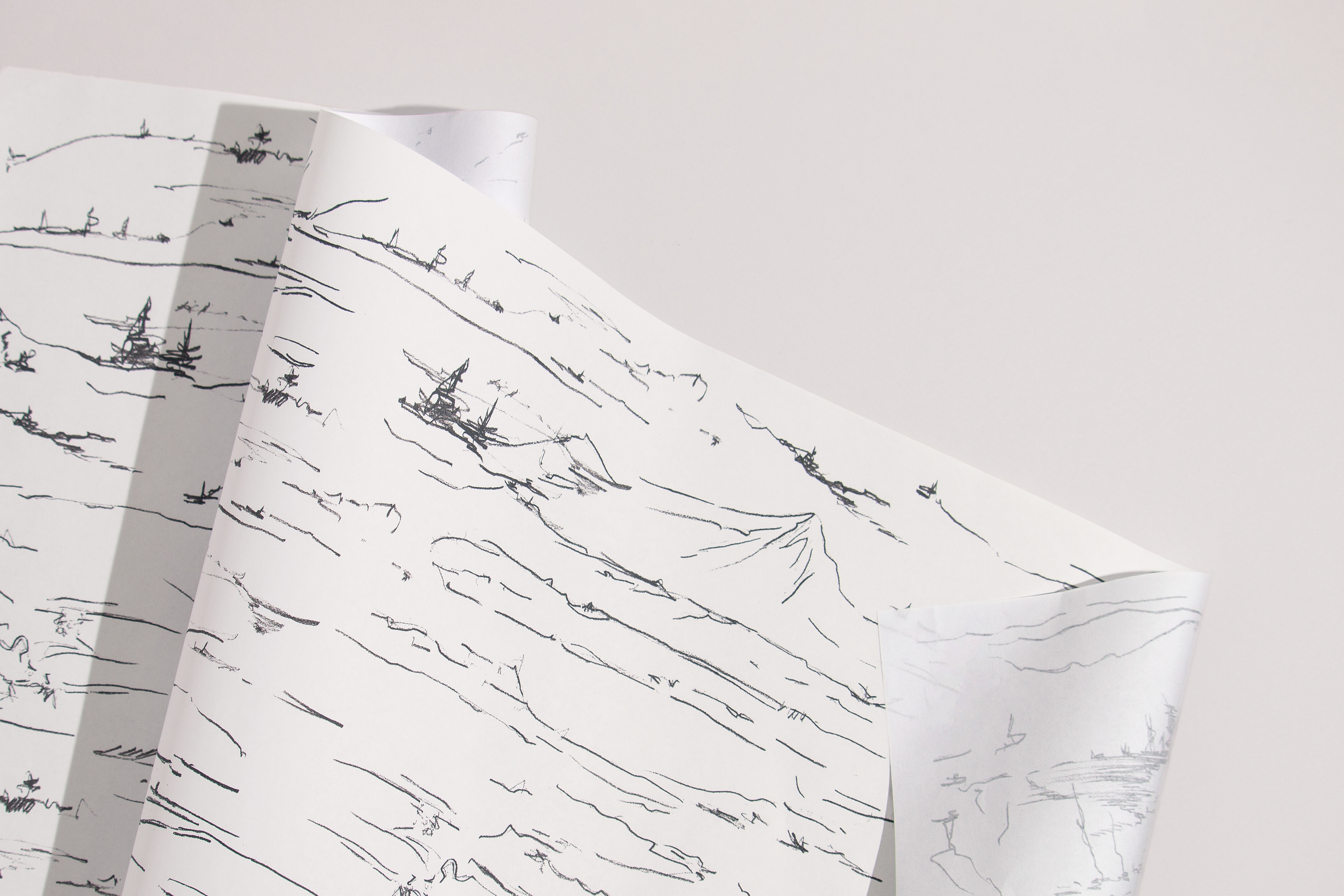
For the identity design we were inspired by the purity of these wines that are made without additives and with minimal intervention. We decided to convey this concept of low intervention through a minimalist and clean language, that at the same time is wild and vital, because natural wines are cruder and more unpredictable than the traditional ones. These are wines that, somehow, are alive.
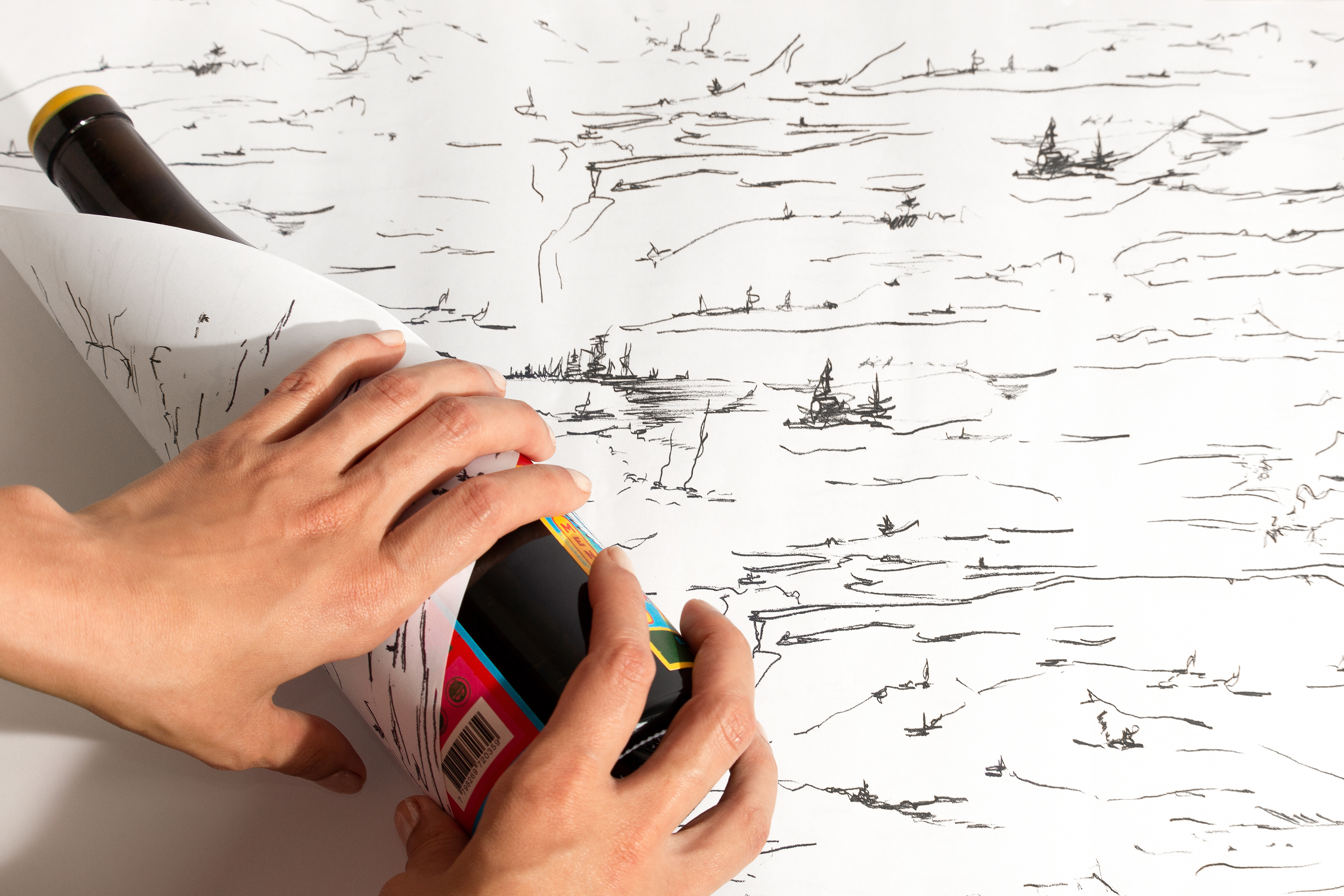
We created a set of illustrations done by hand looking to return to the basics, just as this product does. It is a loose, fast line that suggests rather than to specify. The motifs of the illustrations account for the soil, the landscapes, the stones… They are organic illustrations that speak of the unpredictability of nature, seeking to extract the essence of a place, its vitality, its movement and capture its ephemeral trace.
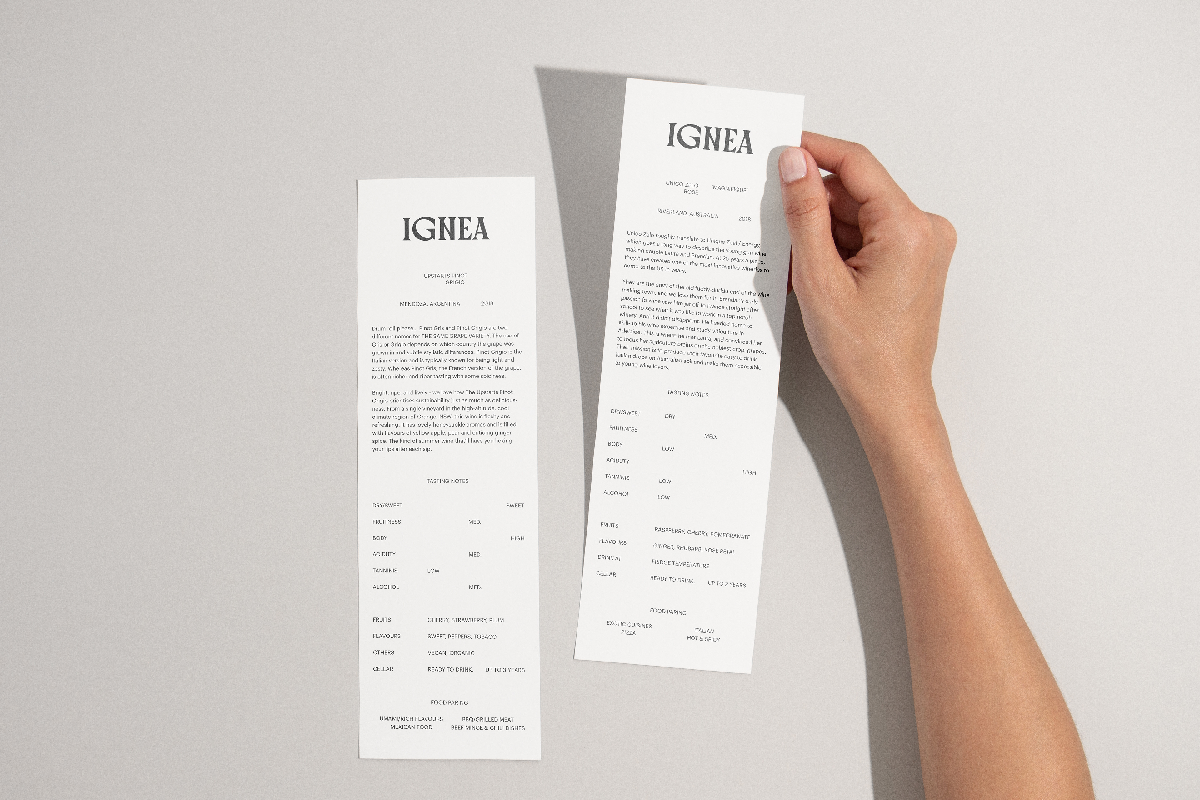
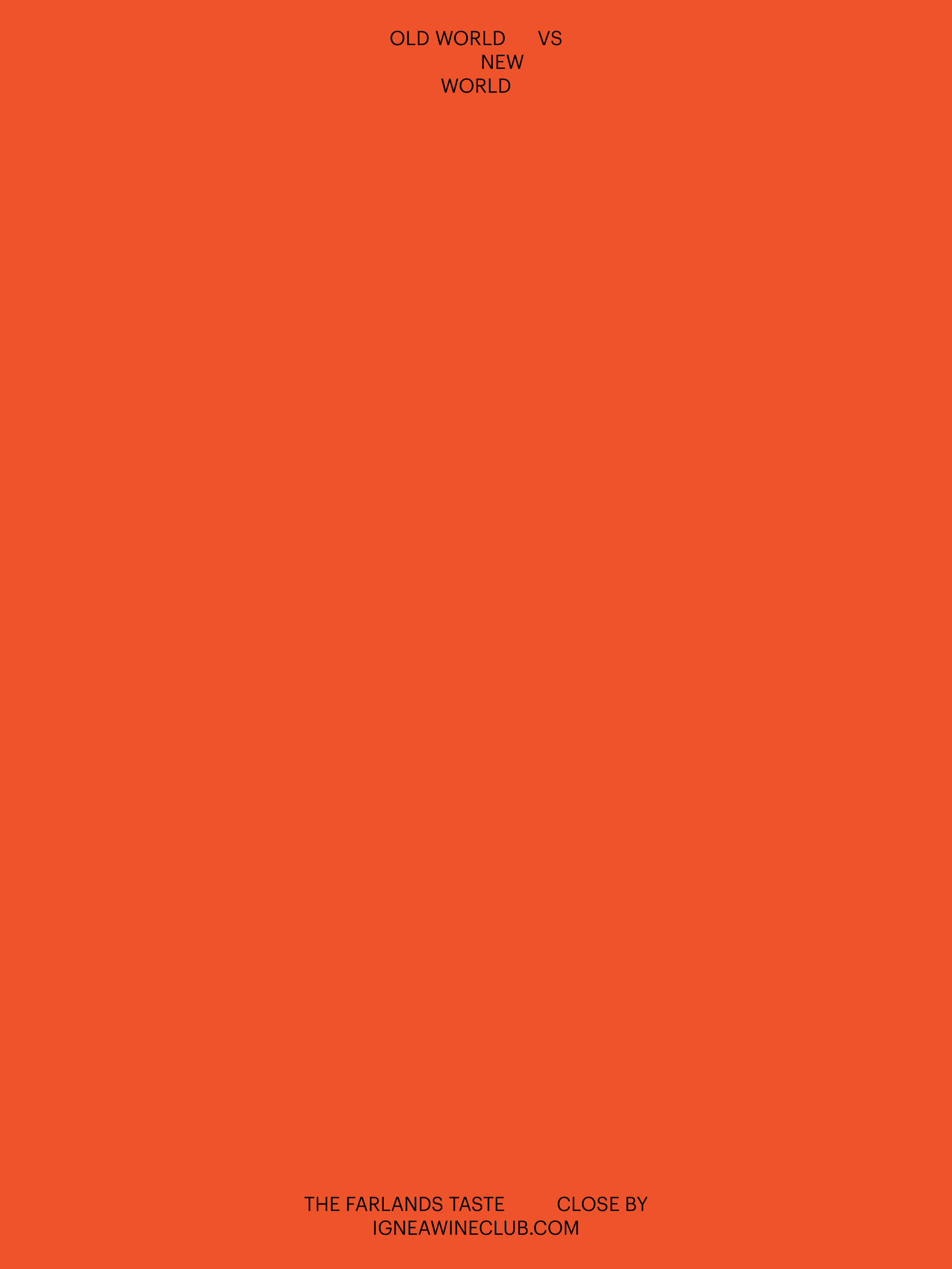
Likewise, the typography proposes dynamic and fluid compositions. They are subtle settings that accompany the organicity of the illustrations. In the search to support the concept of low intervention we used a single typeface always in the same variable and in a single size per layout.
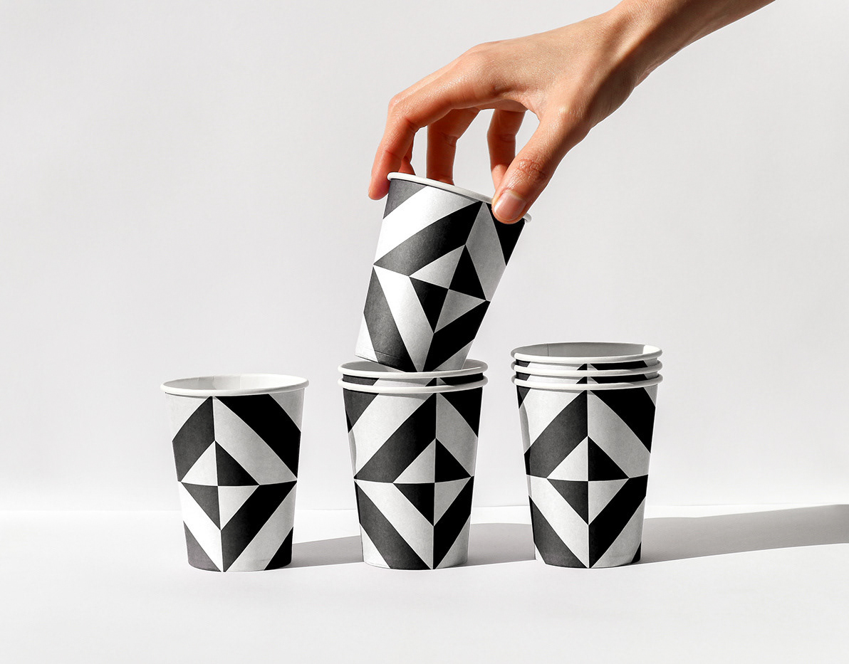
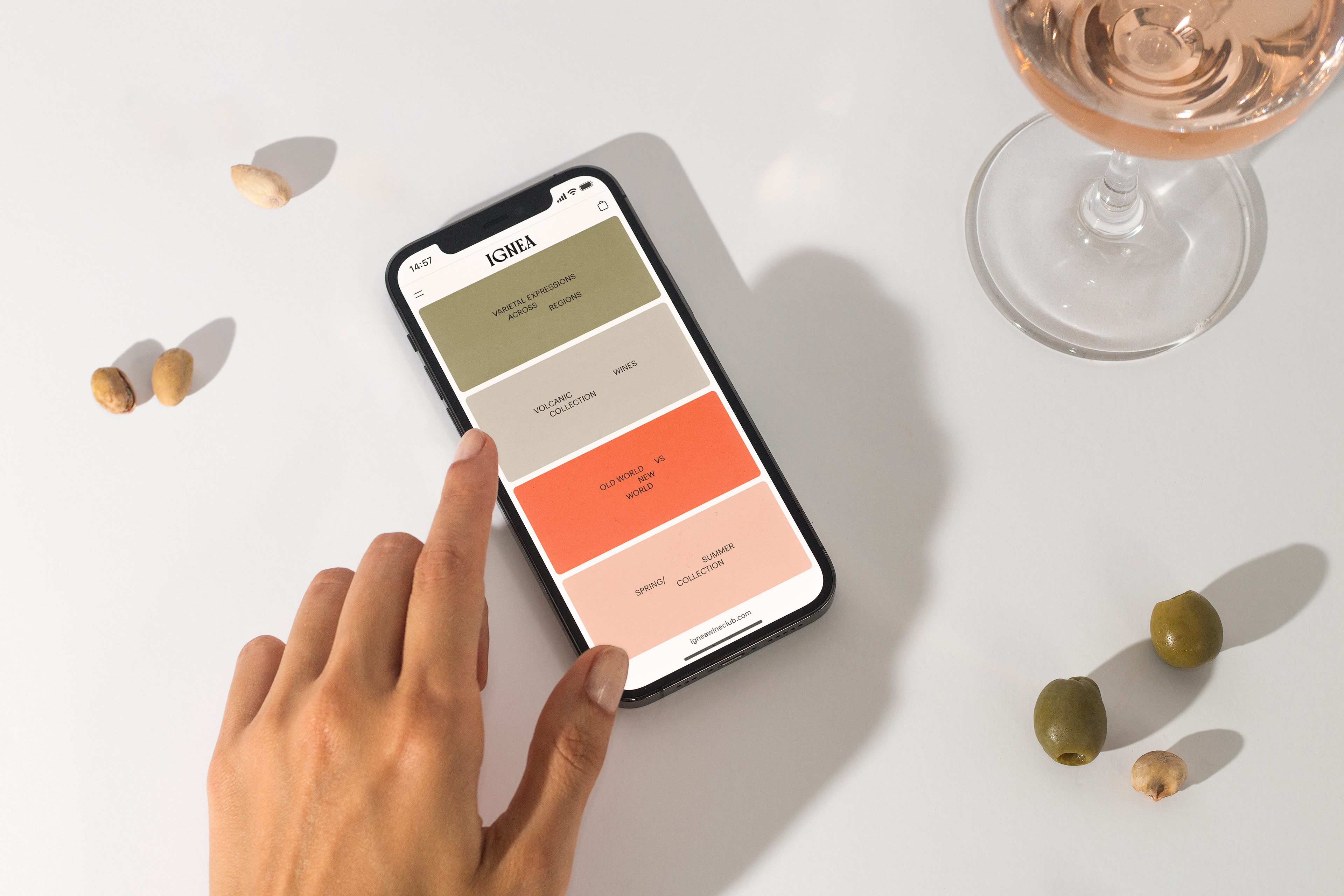
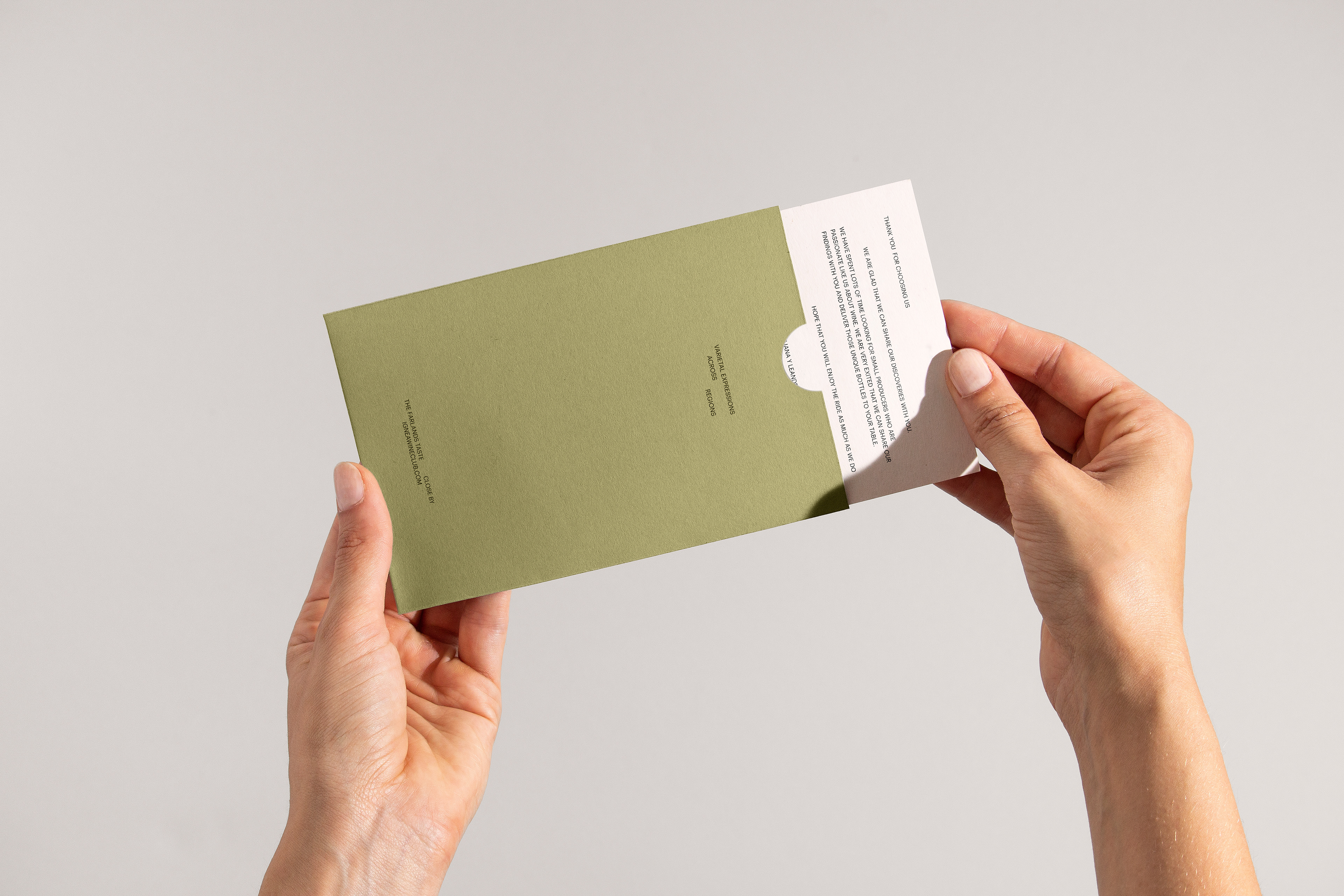
The main palette is reduced to black and white. This decision, in addition to reinforcing the idea of minimal intervention, also collaborates with a sustainable approach, since it allows cheaper printing, avoids the coloration of paper, and generates less impact on the environment. The secondary palette has a functional character, it's used to distinguish and characterize the collections proposed by the brand.
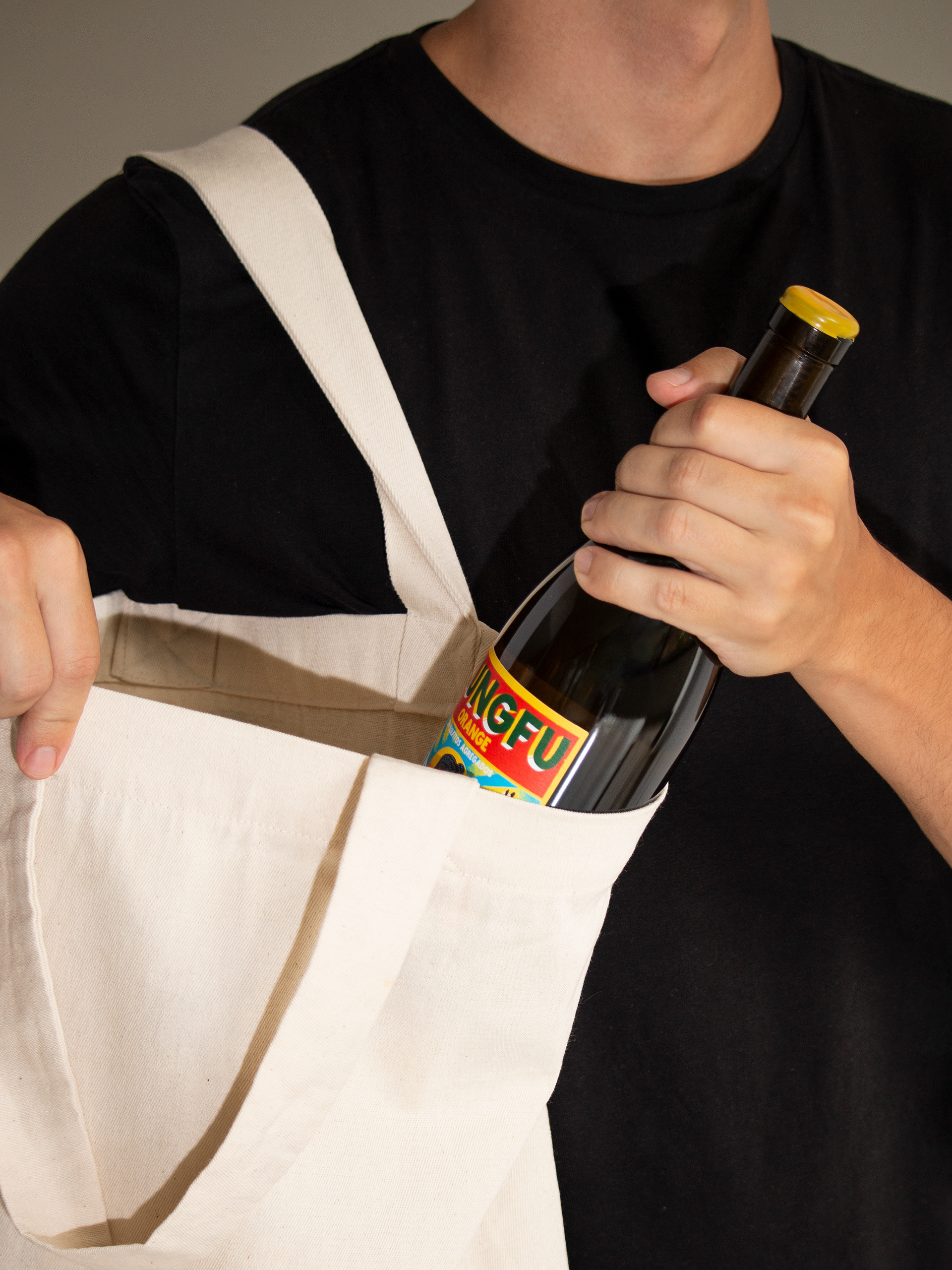
Brand Photography
Art Direction: Asís
Photographer: Magalí Polverino
Food Stylist: Loli Braga Menéndez
Styling Asist: Agustina Salatino
Photographer: Magalí Polverino
Food Stylist: Loli Braga Menéndez
Styling Asist: Agustina Salatino
Case Study Photography: Rocío Fernández Charro